

MatthiasKNU
-
Posts
153 -
Joined
-
Last visited
-
Days Won
2
Content Type
Profiles
Forums
Downloads
Posts posted by MatthiasKNU
-
-
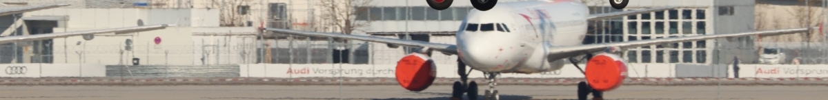
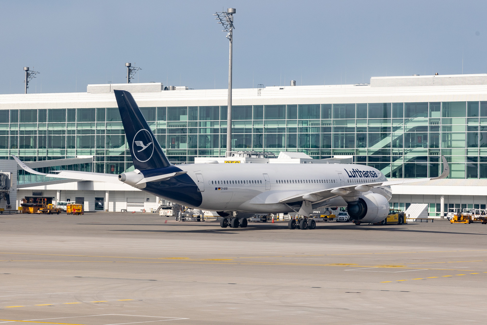
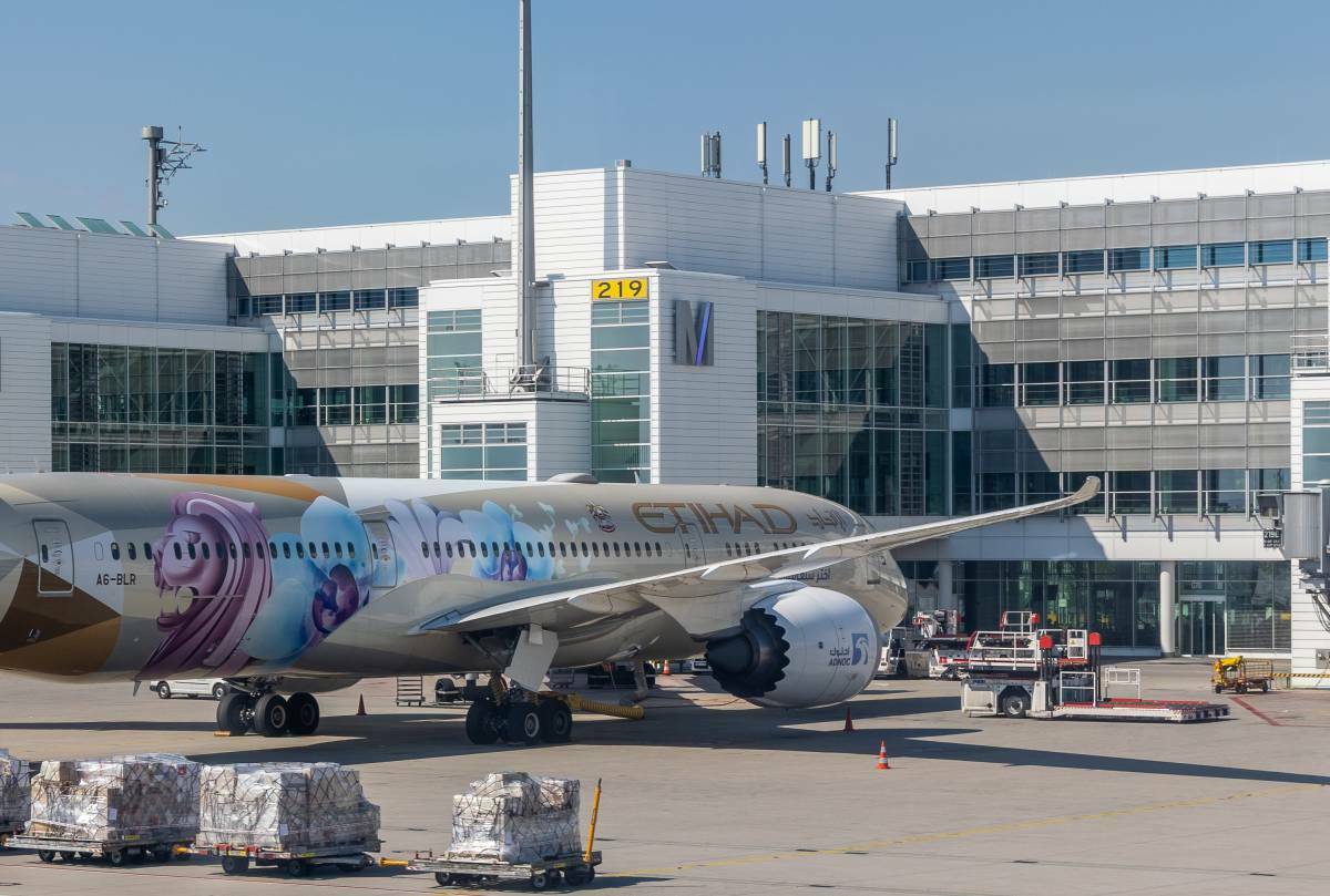
My picture for this month:
Just arrived in Boston with the A380, then the loaders can come to unload!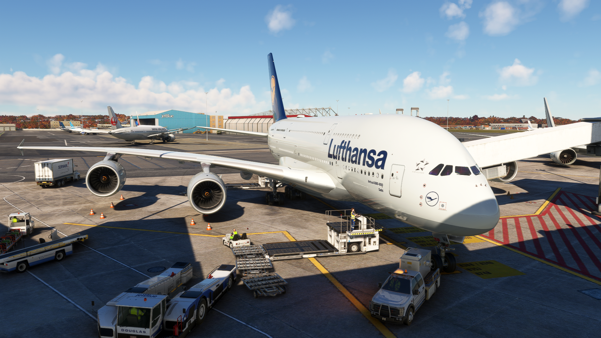
-
 1
1
-
-
-
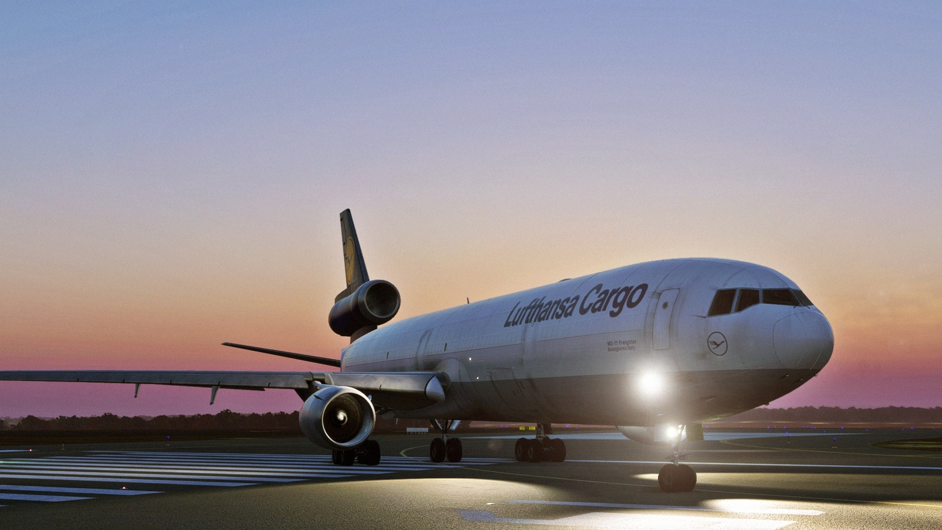
Departure just in time for sunrise with the lovely MD-11 in Dakar heading to Viracopos.
It doesn't get much lovelier than this!
-
1
-
-
Dear Thorsten,
Thank you very much!
Of course I realise that many of the improvements are not quite so simple!
I also don't see a highly detailed interior, for example, as being that important, but in the end the performance has to be right as well!Nevertheless, there are of course some important aspects, especially concerning the colors or many details on the airside, e.g. the many doors/roller doors/details on the "ground" of the terminals, trees, or the south side of Terminal 2.
I have already sent you some pictures by PM, I hope they help!
Here, so that others can also see the pictures, but the ones mentioned:
The Audi banners (unfortunately I have few pictures, but many where airplanes are in front of them...):
The T2-Jetways, now without O2 Ads again:
And the gray sun shades on Terminal 2:
-
1
-
-
Dear Thorsten,
Thank you for your message, I hope that my many points will help you to improve Munich!
Am 3.10.2023 um 08:34 schrieb MatthiasKNU:I myself would - if it would help a little - hang for days on the fence and photograph every angle that can be seen from the outside.
Oh well, this offer is still valid of course!
-
Dear @Aerosoft Team,
Now that almost half a year has passed and things are getting more and more concrete with Frankfurt:
Is there finally a commitment to a better MUC?
-
1
-
 2
2
-
-
Mine for this month:
Leaving Munich
-
1
-
-
Hello all.
Yesterday I was briefly at MUC, and I noticed sooo many errors again... sorry.
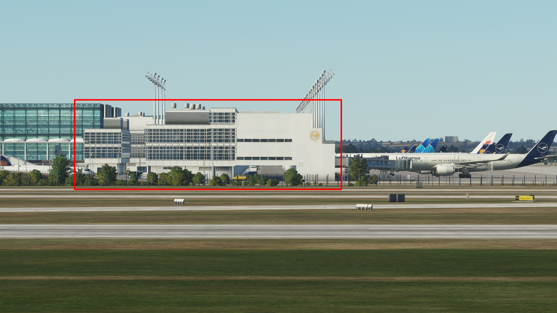
I have now again photographed the most serious and put together here:The south front of T2 - here you can see very nicely what doesn't fit here:
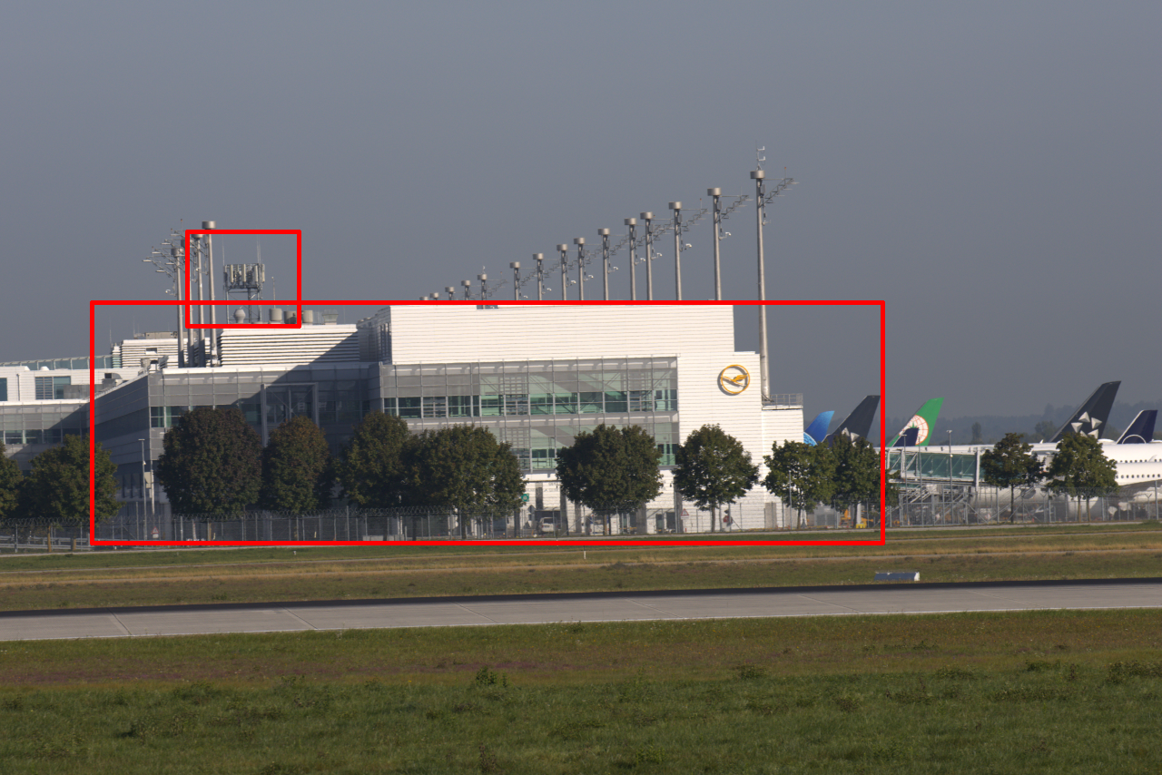
The antennas on the T2 are also completely missing.
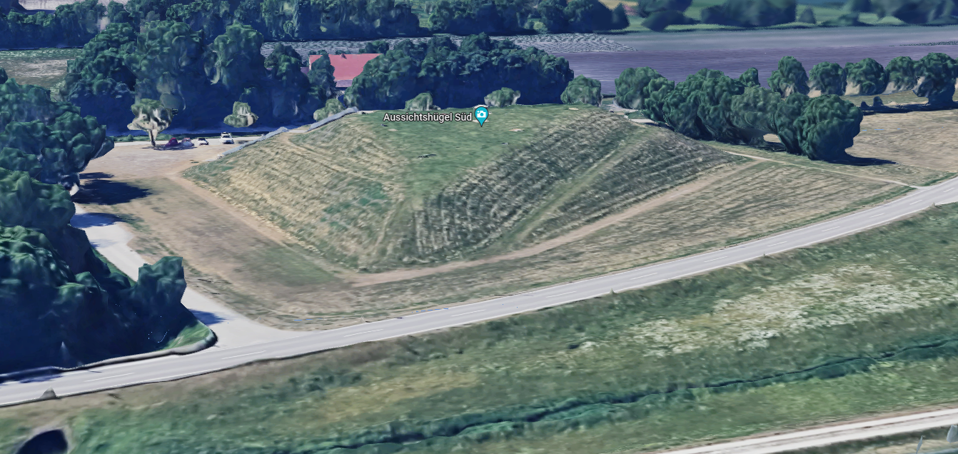
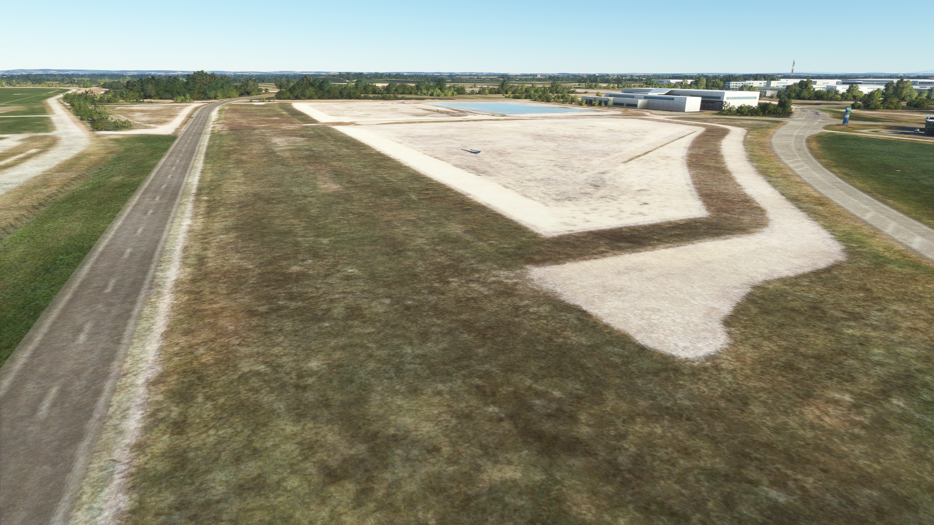
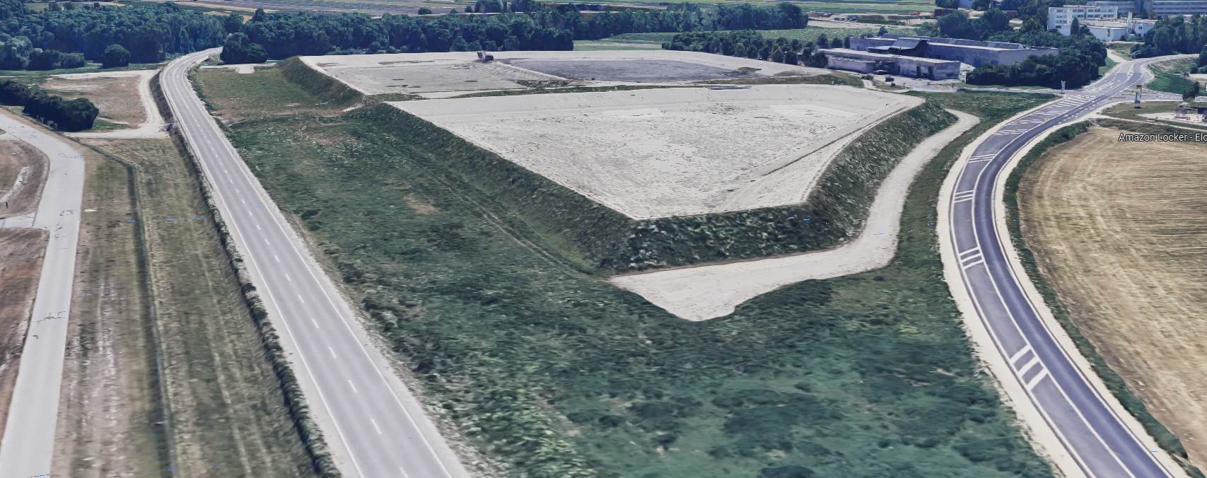
South Hill: What is that, please?
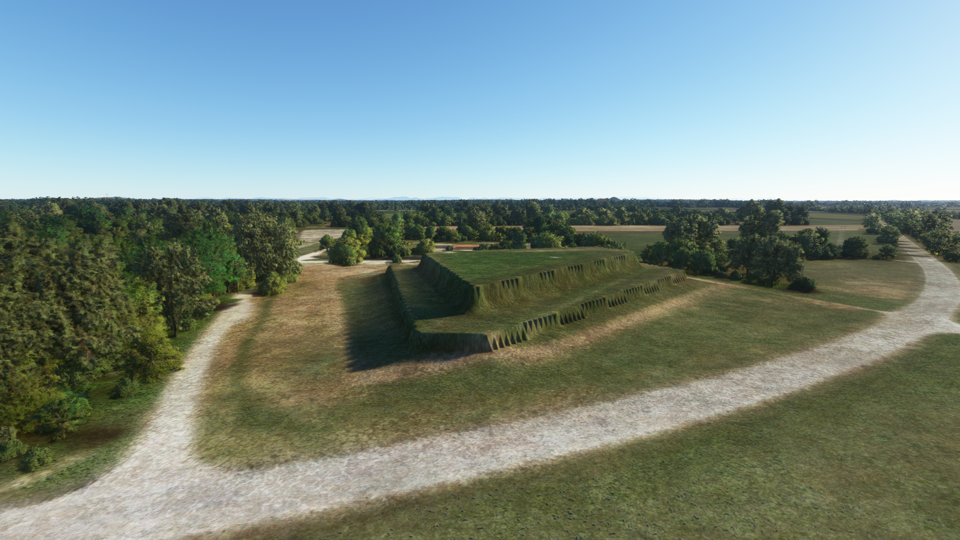
This is what it should look like:
This was already done better in the ancient version of the German Airports Team for FS9!
The water reservoir in the north is not flat - otherwise the water would run out.
In the south, along the road, a wall was heaped up quite a long time ago:
The part between the two parking garages is not only glass:
The fact that the advertising is not correct, the contrast between glass surfaces and ceiling elements at the MAC, traffic signs are missing I will overlook now.
In the northeast, some taxisigns are missing from the turnpad:
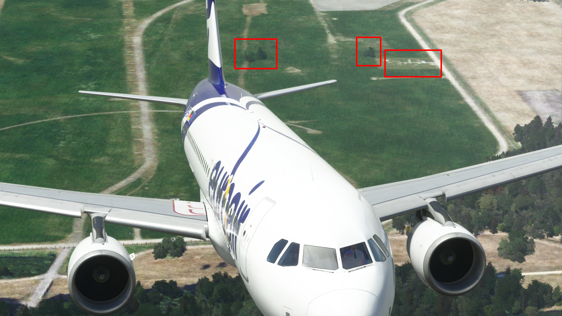
Very serious: trees! How could I have overlooked that until now!
The whole airport is green, no desert like in the SimWings variant!
Hundreds and thousands of trees are standing around at MUC, here only a small section: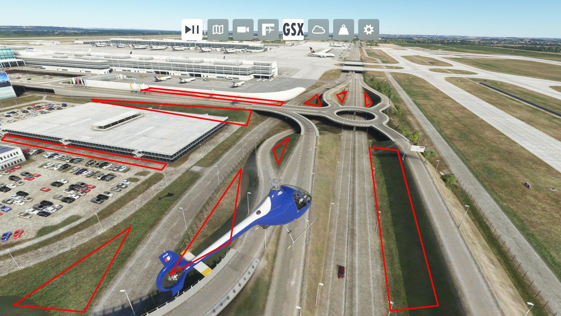
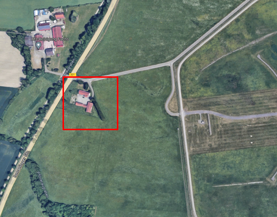
On the approach to 08R, there is a rather prominent farm directly in front of the airport area - this was even included in the P3D variant. In the MSFS version it is even missing completely.
Dear @Aerosoft Team, dear SimWings-Team (@autopiloth) - By now this thread has more than 4500 views - more than almost any other post in this forum. This shows that there is really interest in a good MUC.
Please, please, please - Improve MUC.
Or maybe @Jo Erlend- one of the best developers there is - might take on MUC sometime in the future (after FRA...)? It would definitely be worth the wait.... I myself would - if it would help a little - hang for days on the fence and photograph every angle that can be seen from the outside.-
5
-
 2
2
-
2
-
-
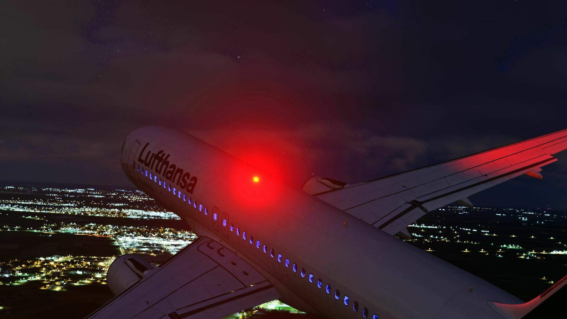
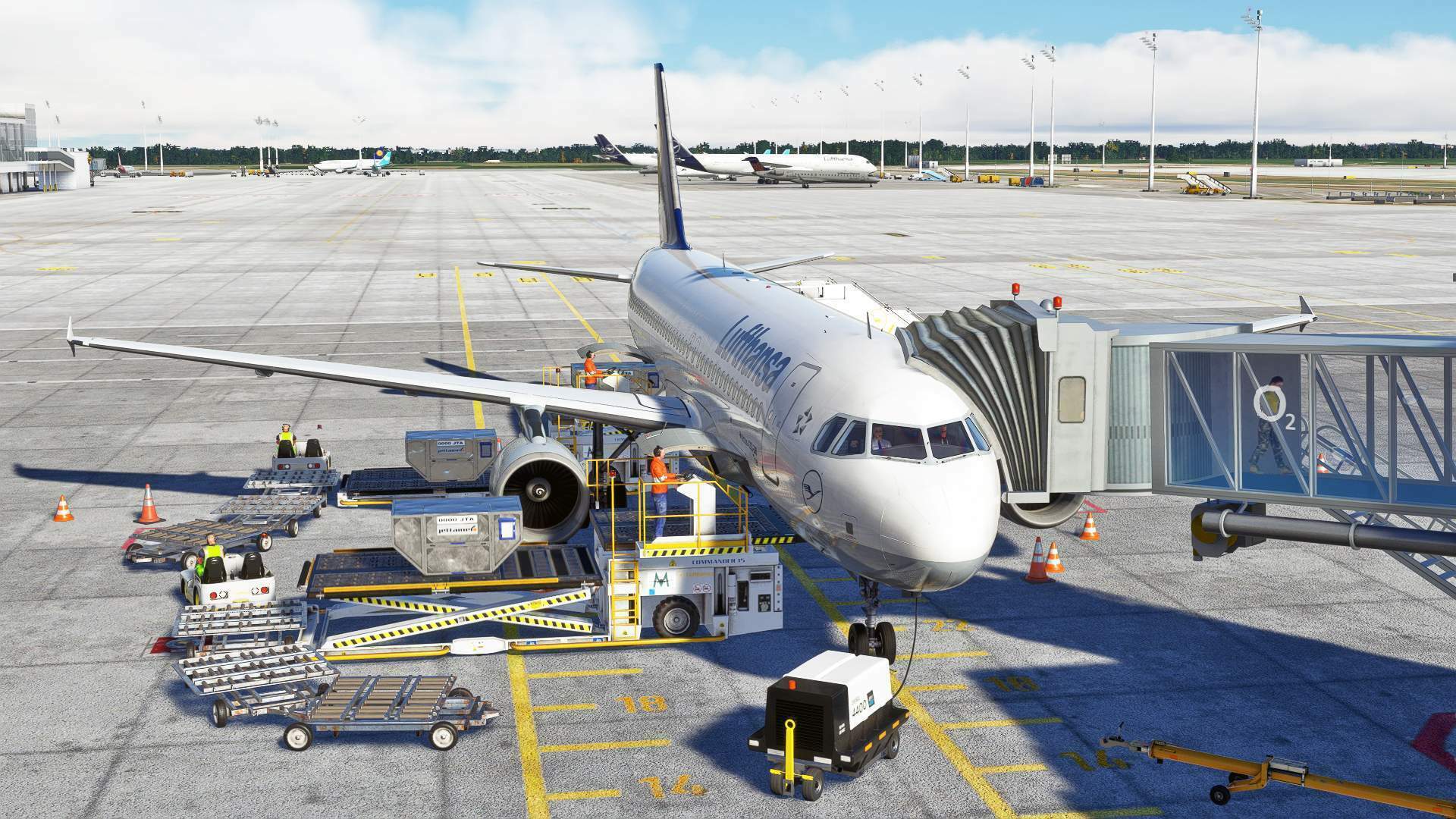
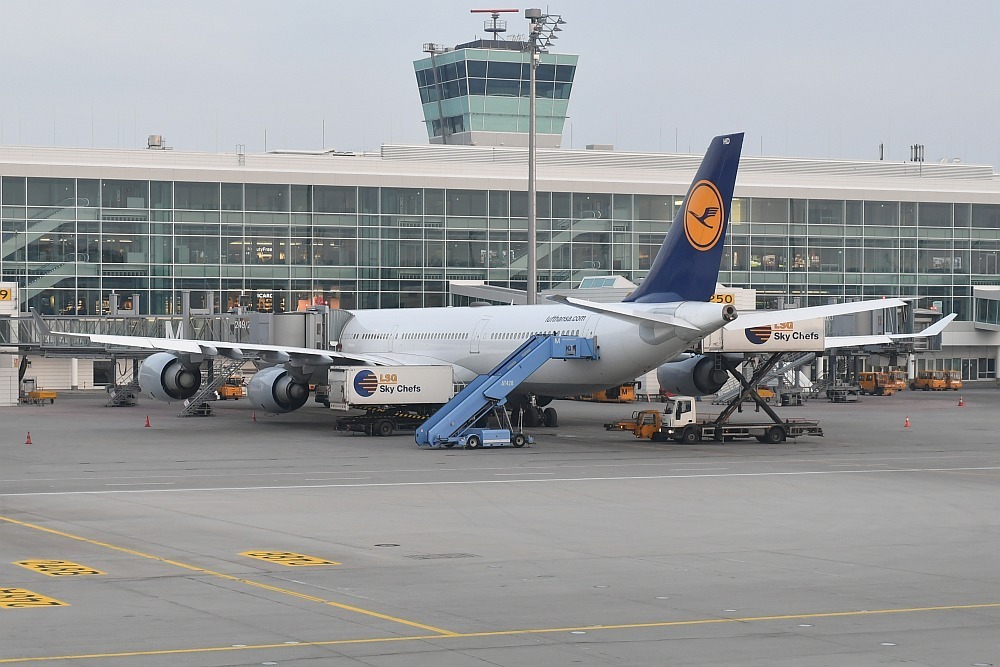
Then here is mine for this month:
Just arrived with a Lufthansa A320 in Munich
-
2
-
-
Meanwhile more than 2 months have passed - are there any news from @Aerosoft Team or SimWings?
-
1
-
-
vor 20 Stunden schrieb Mathijs Kok:
Of course, that is possible, but that easily triples the amount of polygons and resource use. For a smallish object like this, not a problem, but that just leaves the next object that could use a few more polygons open to discussion.
A good modeler (and this project is done by one!) will decrease the level of detail the further you get from a normal viewpoint. The image you show is a view that is simply not where an aircraft crew would ever see it. When I look at it from a closeby stand, it is not something that stands out in my opinion. If I would be the modeler, I would not add more polygons to this object. If I had some to spare, I would always use them to make a very close more detailed object.
You are absolutely right, a good scenery is also characterised by saving polygons in unimportant areas and also using LODs.
The Lufthansa logos are also directly on the stands - i.e. really in the viewing area from the cockpit, and even there you can see the corners very clearly. Therefore - yes, it really stands out.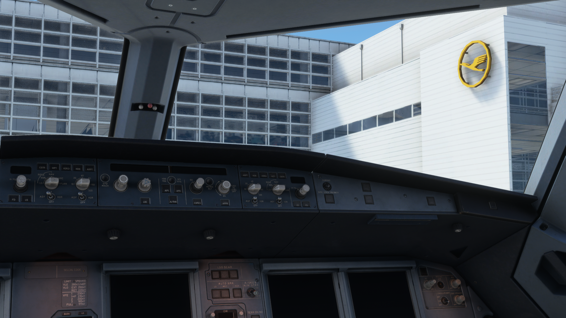
However, I have to agree with Timm here:
A few more polygons definitely wouldn't have hurt - but it's simply due to the fact that the models were originally created for XP, then some polygons were (probably) removed and the whole thing was adapted to P3D.
As we all know, MSFS can handle many, many, many more polygons as P3D. Since the scenery was only transferred to MSFS, unfortunately no more adjustments were made to these models here, although MSFS would have had many more possibilities.-
3
-
-
- Popular Post
- Popular Post
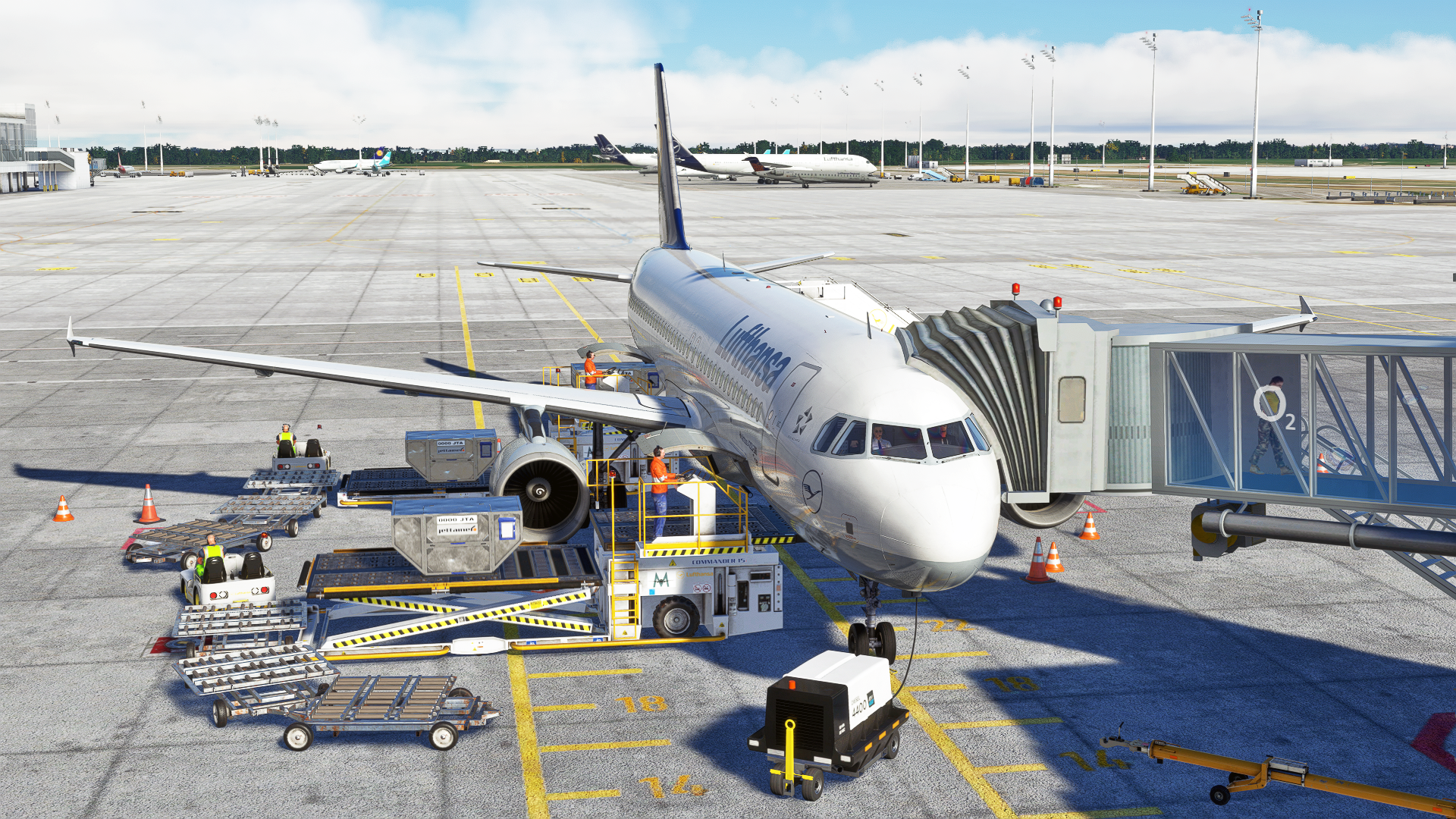
Dear SimWings team,
first of all I would like to say thank you - thank you for not losing sight of MUC, and for this update - even free of charge! That is not a matter of course, so thank you for that!
I had already noted some inconsistencies in the P3D version, which I have now found again in the "new" version, and a few more points. I would like to share these with you in the hope that the MUC will be improved again.
Many who don't know the MUC in real life might say that you can't see these little things. But that is not the case. If little things are missing on the land side, then you can overlook them.
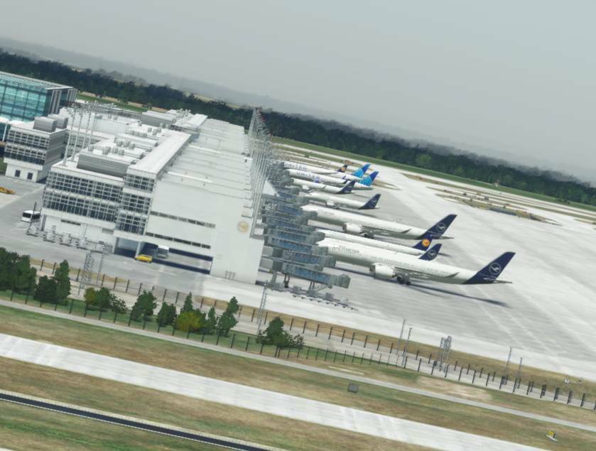
But in some places - especially on the airside, which you see any time you're flying in and out of MUC - there are big mistakes.I already have a whole list, so I would now like to try to list everything in a more structured way:
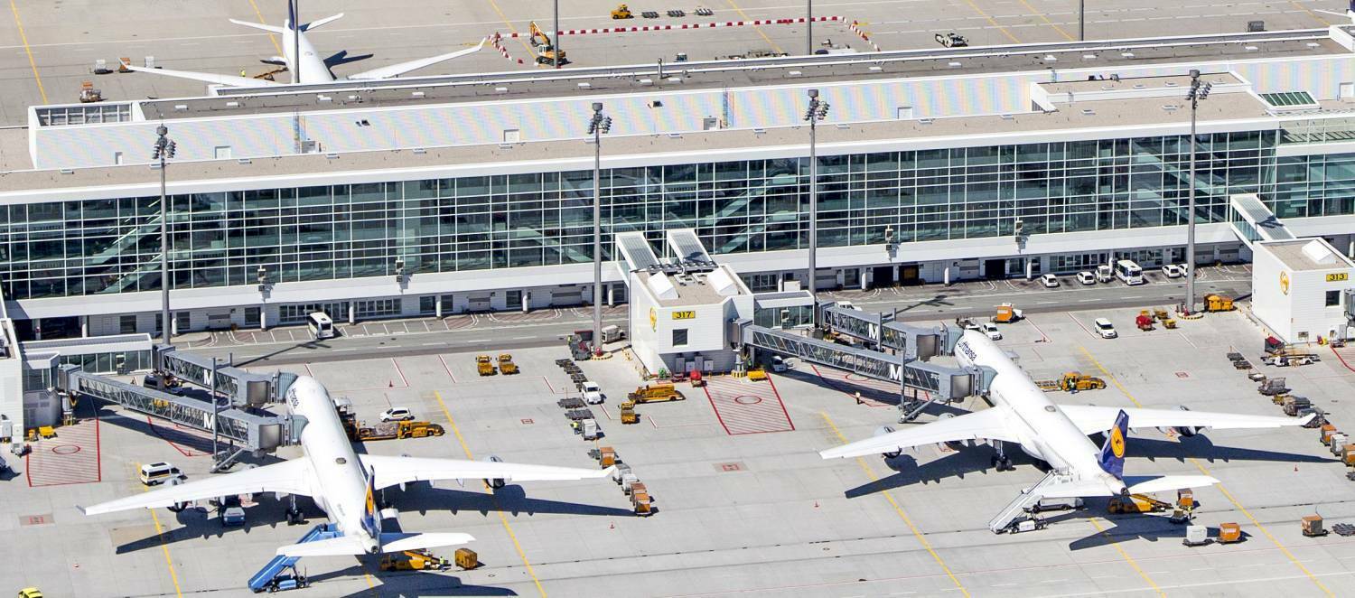
Starting in the East, Terminal 2 and also Terminal 2 Satellite:
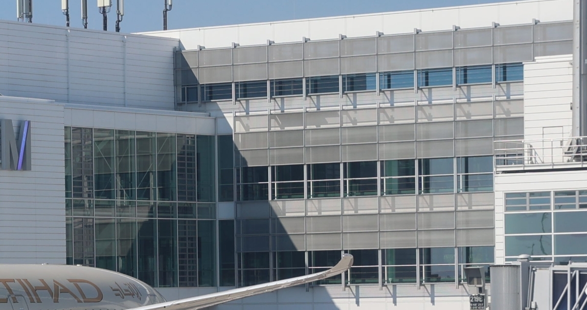
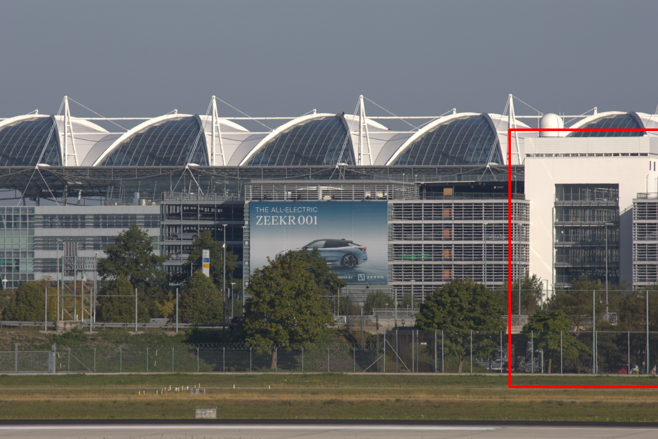
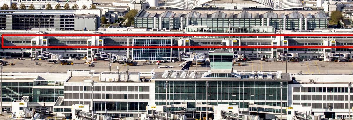
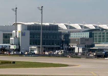
1. Unfortunately, the colour of the glass surfaces at Terminal 2 is still not right. The glass surfaces are very characteristically greenish. It depends on the incidence of light, but they ALWAYS have a greenish shimmer.
With the P3D, I was tempted to say that the P3D couldn't display it properly at all. But the MSFS should be able to do that.Here's how it looks like:
... and what it should look like in different light conditions:
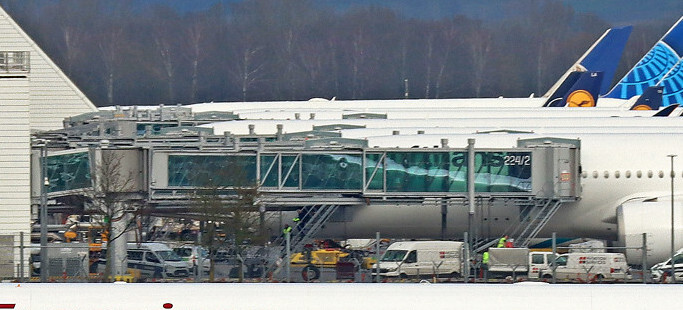
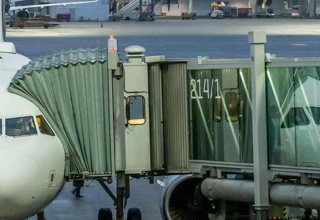
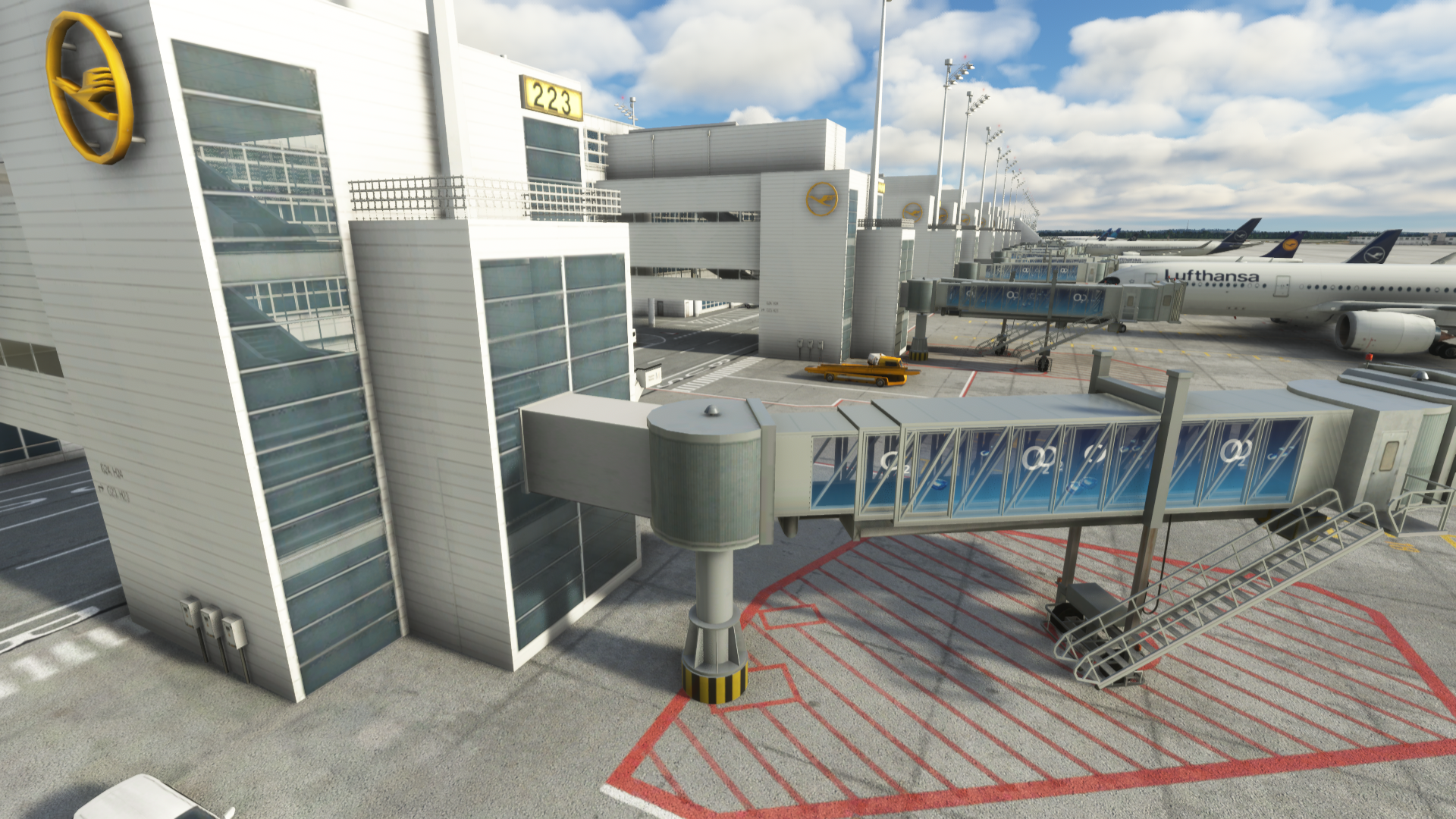
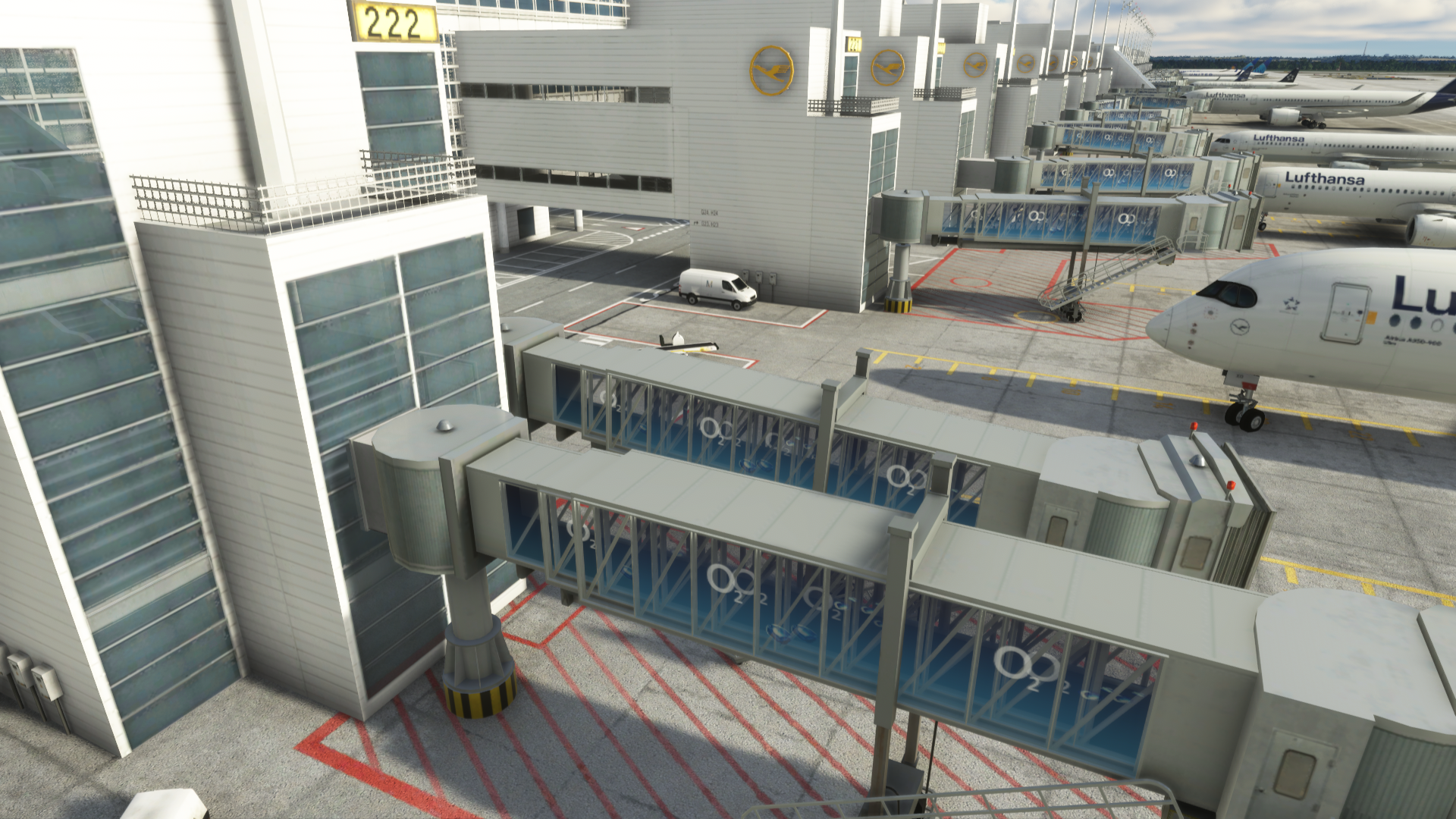
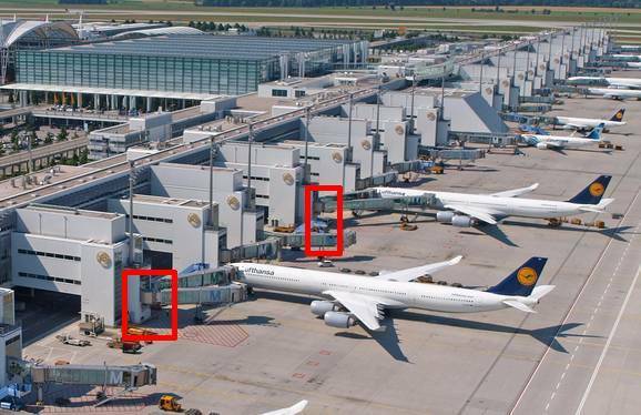
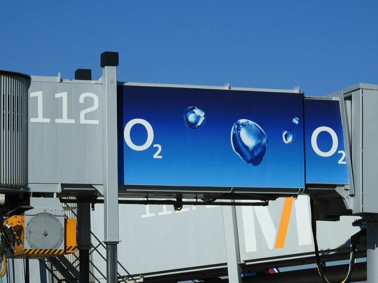
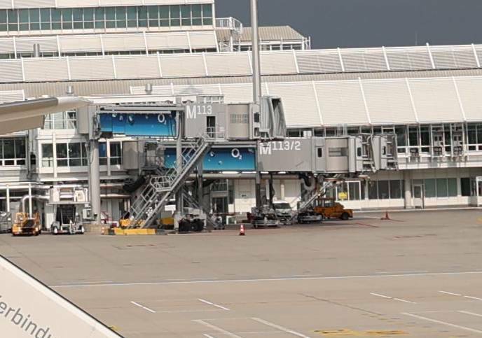
2. The O2-Advertisments on the Jetways are gone since a few months:
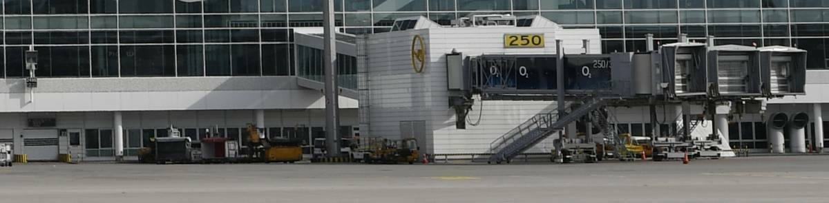
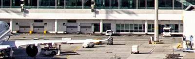
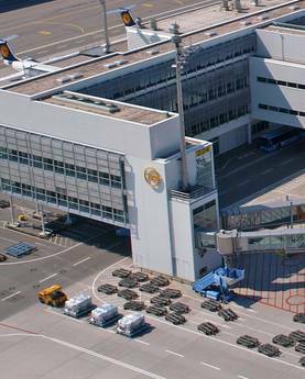
3. Even if it's not quite trivial: the jetways also have the stand number on them, which is completely missing!
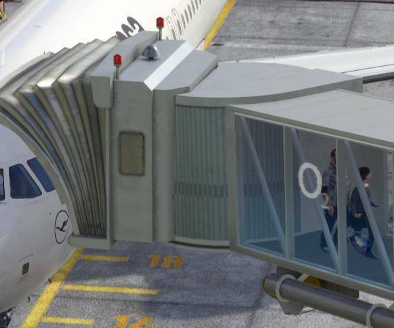
vs. Real:
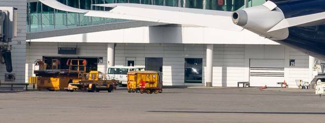
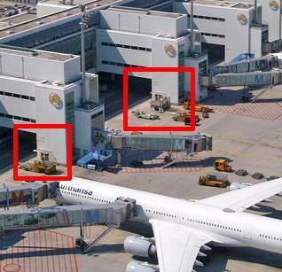
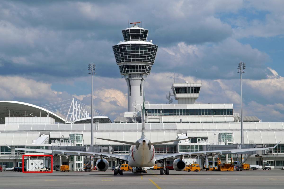
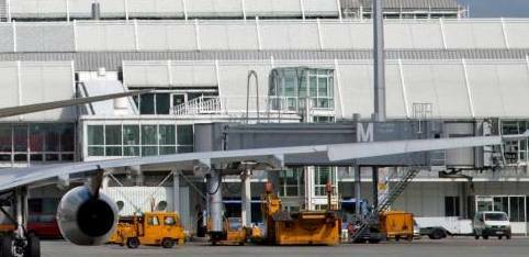
4. North of stand 213 the exhaust air stacks are completely missing!
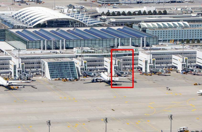
5. The sunshades are shown as a white grid in the scenery, but in reality they are grey and not a simple grid.
6. Terminal 2 itself lacks many, many details such as doors, windows, rolling doors, entrances, etc.
7. Many small details such as canopies are completely missing.
8. With the many "M" on the facade, the "/" stroke slowly but steadily changes colour.
In the scenery it is simply shown in white, which doesn't really fit at all. Either coloured, or the colour changes through.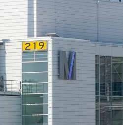
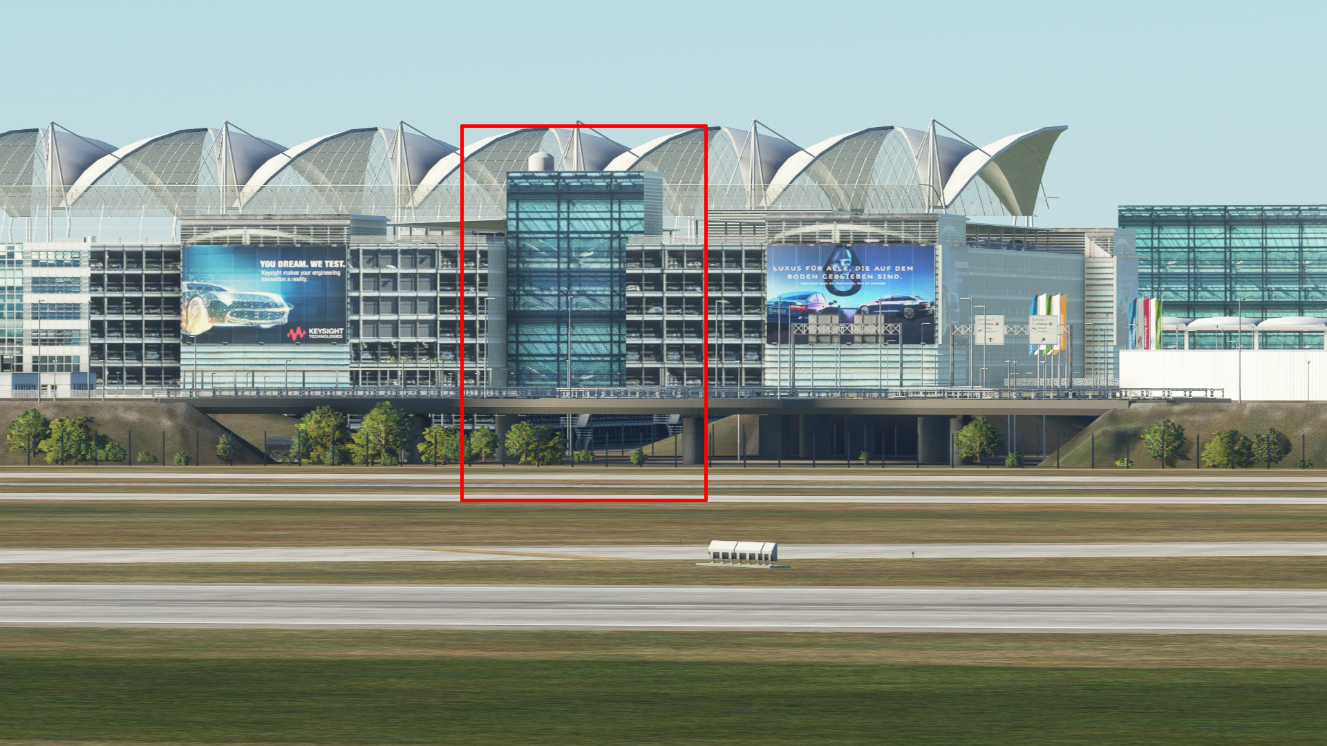
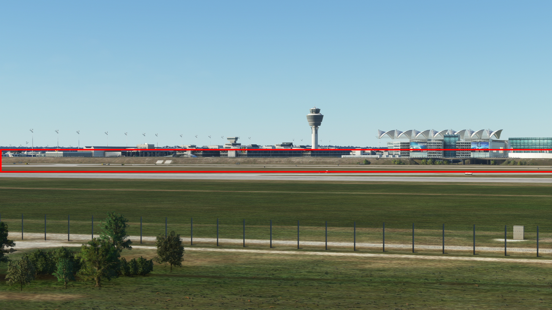
9. In my opinion, the biggest mistake in the scenery: The south and north sides of Terminal 2 have NOTHING to do with reality.
10. The connectors between jetway and terminal should be made of glass
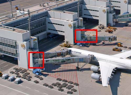
11. There are no pillars on the jetways, which are mounted on Terminal 2 without a connector.
That's the big things about T2 for now.
Let's Continue...
Terminal 1 (i.e. the "old" part) is also missing several details, as can be seen here: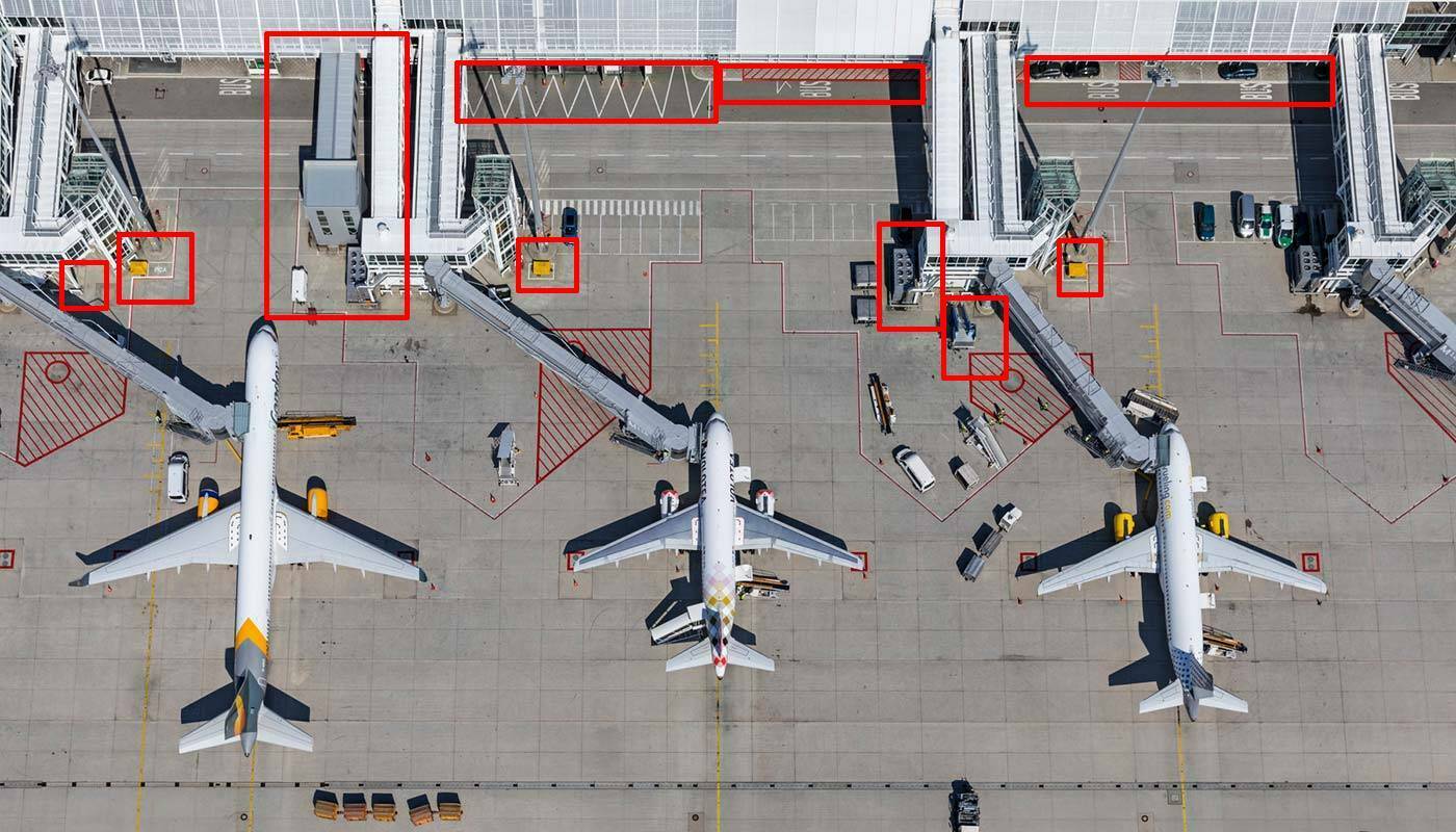
The jetways that are "built into" the scenery at Terminal 1 have unfortunately not existed for many years. At least the O2-Advertisments are ok, but the front part of the jetway is much more angular and a "M" with the stand number is on it.
The glass surfaces at Terminal 1 also have a slight green sheen, but this is nowhere near as prominent as at Terminal 2:
Inside the Airport:
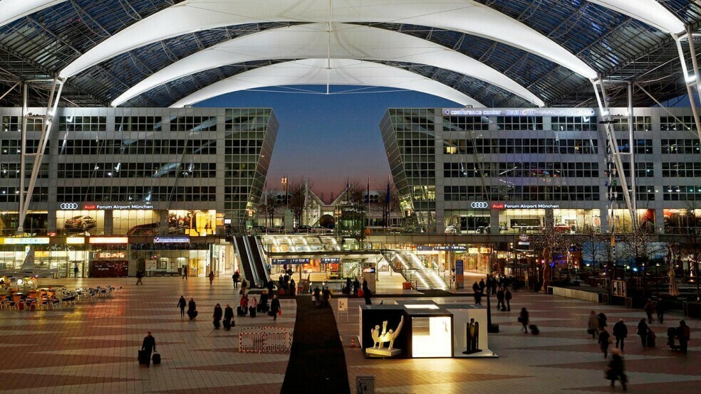
The Advertisment in the Munich Airport Center (The one with the A380...) is already since 5 years replaced with a different one (To be honest, I was in the MAC just last week, but I can't tell off the top of my head which advertisements are on it at the moment).In general: Even if it is not that important to me personally, it has become standard for sceneries in this price range that the interior is modelled properly. MUC is such a beautiful airport - also from the inside - it would be a pity if there were no improvements.
To stay in the MAC:
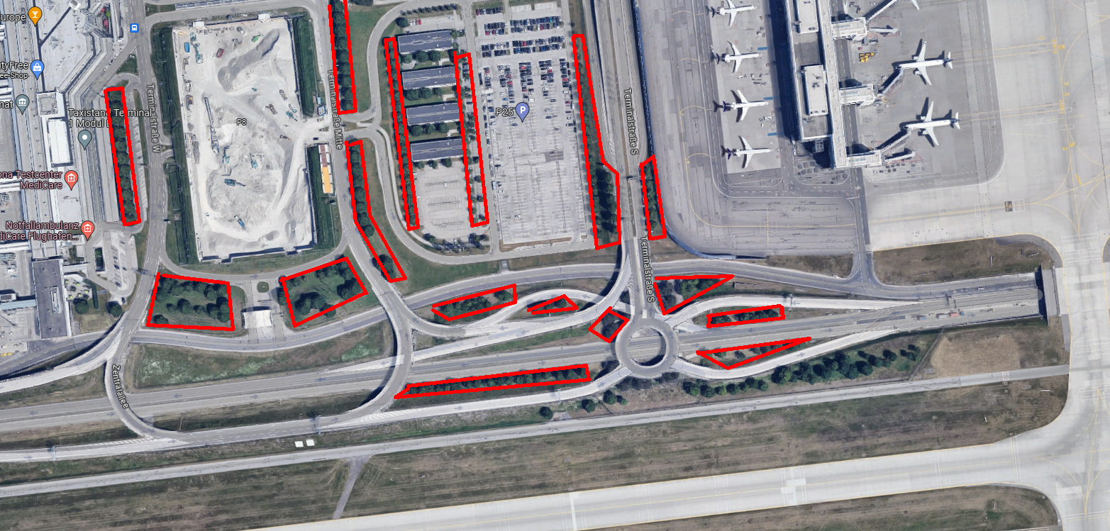
The MAC as a whole seems very, very loveless. On the west side, the buildings are also much, much, much too far apart. In real life, they are much closer together: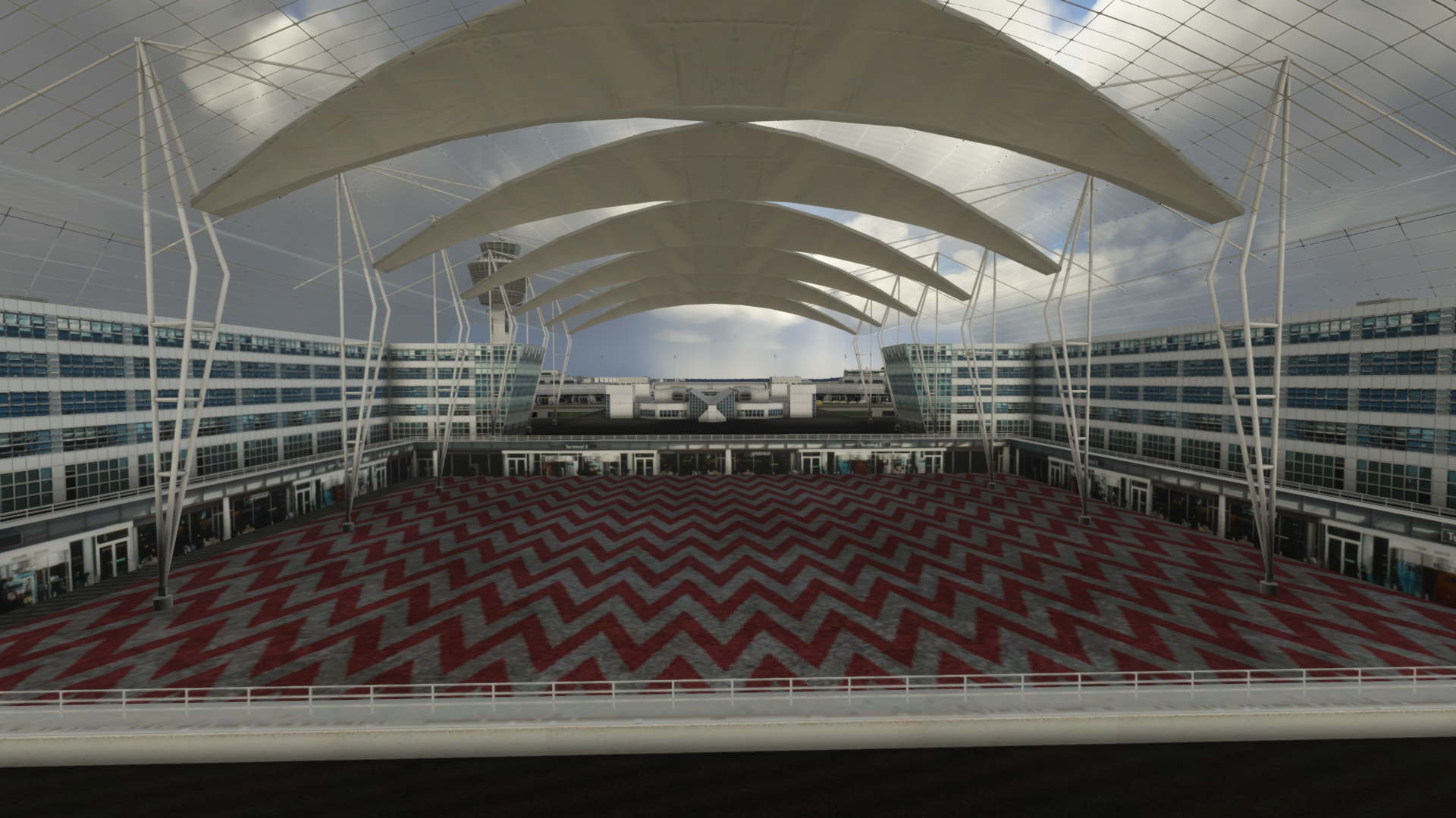
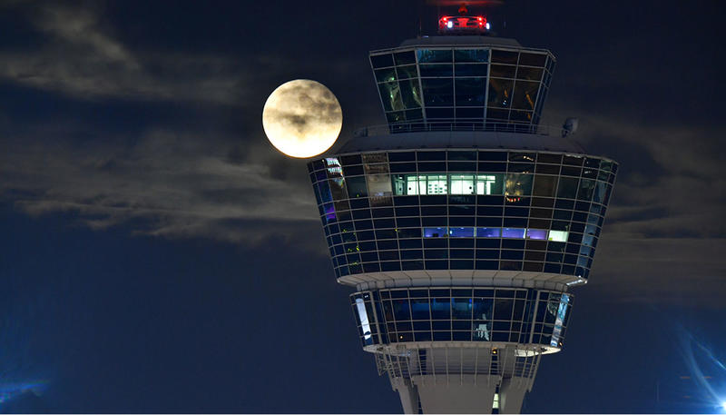
Coming to the Tower:
The tower is also missing many details, especially the ladders in the north: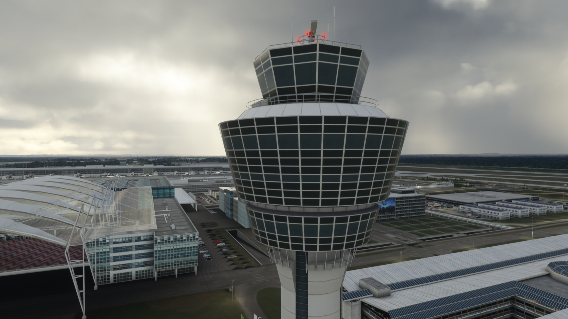
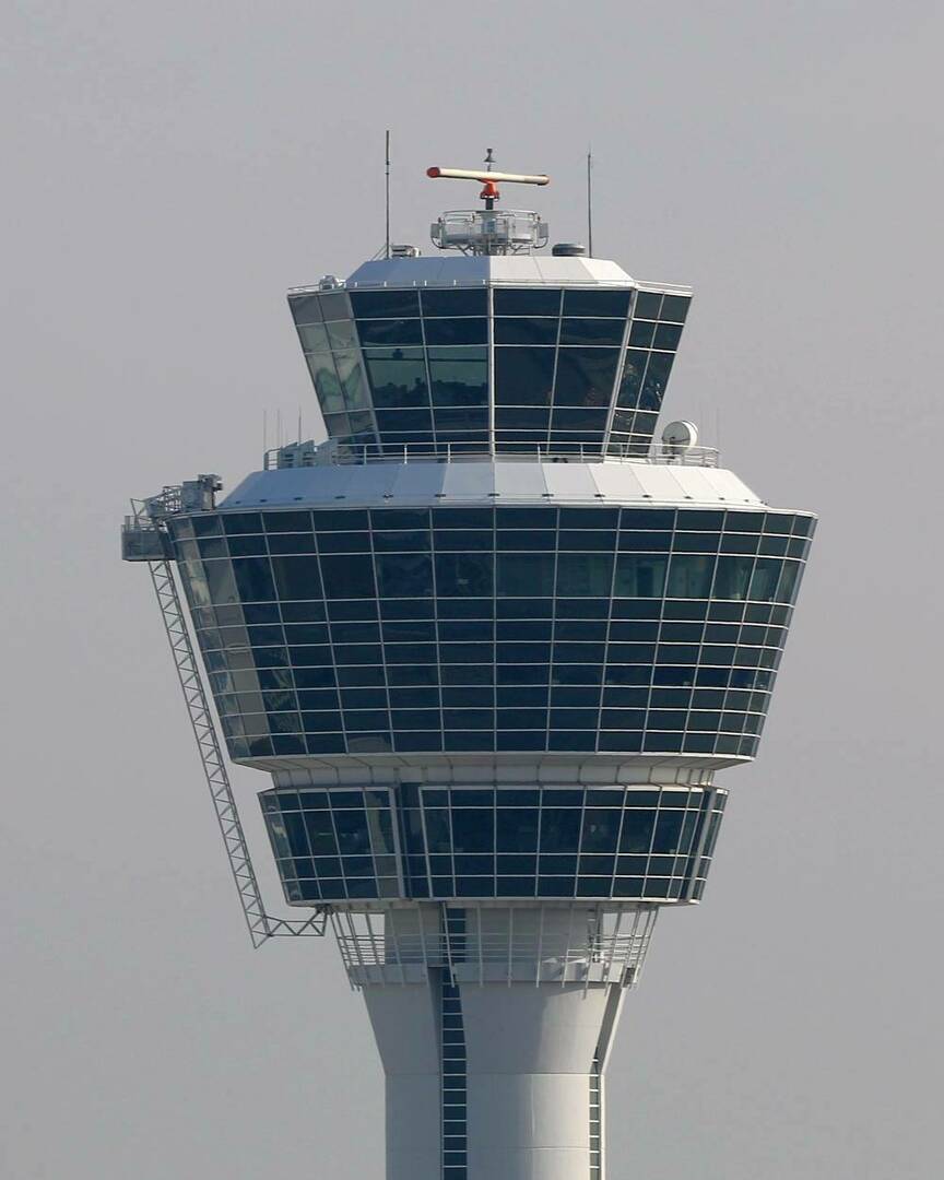
Also, what doesn't fit at the Tower either: At night, only "individual windows" are illuminated - not entire "rings".
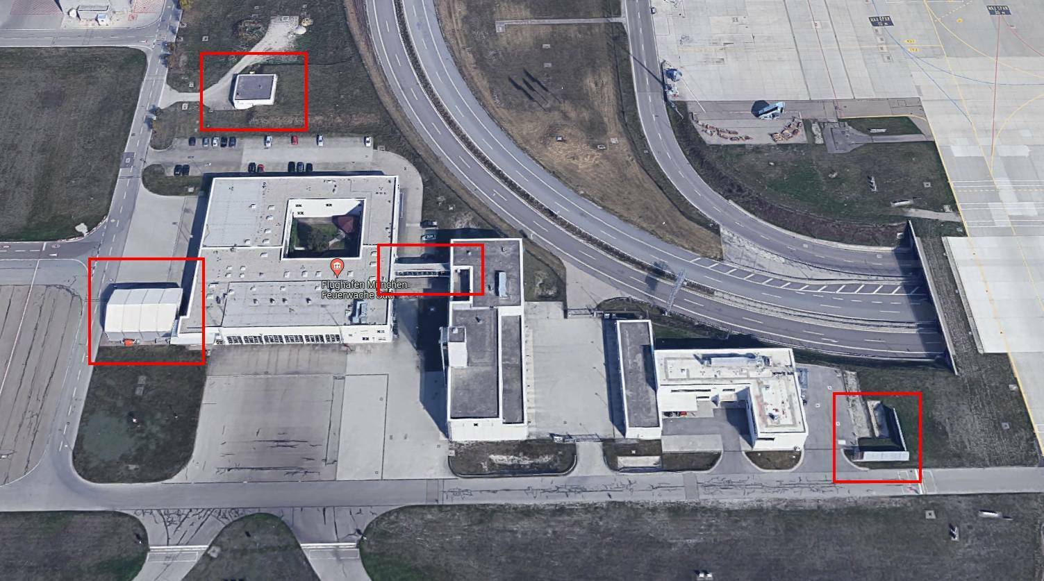
Unfortunately, the main fire station also lacks a lot of detail, even though you always taxi past it with the plane.
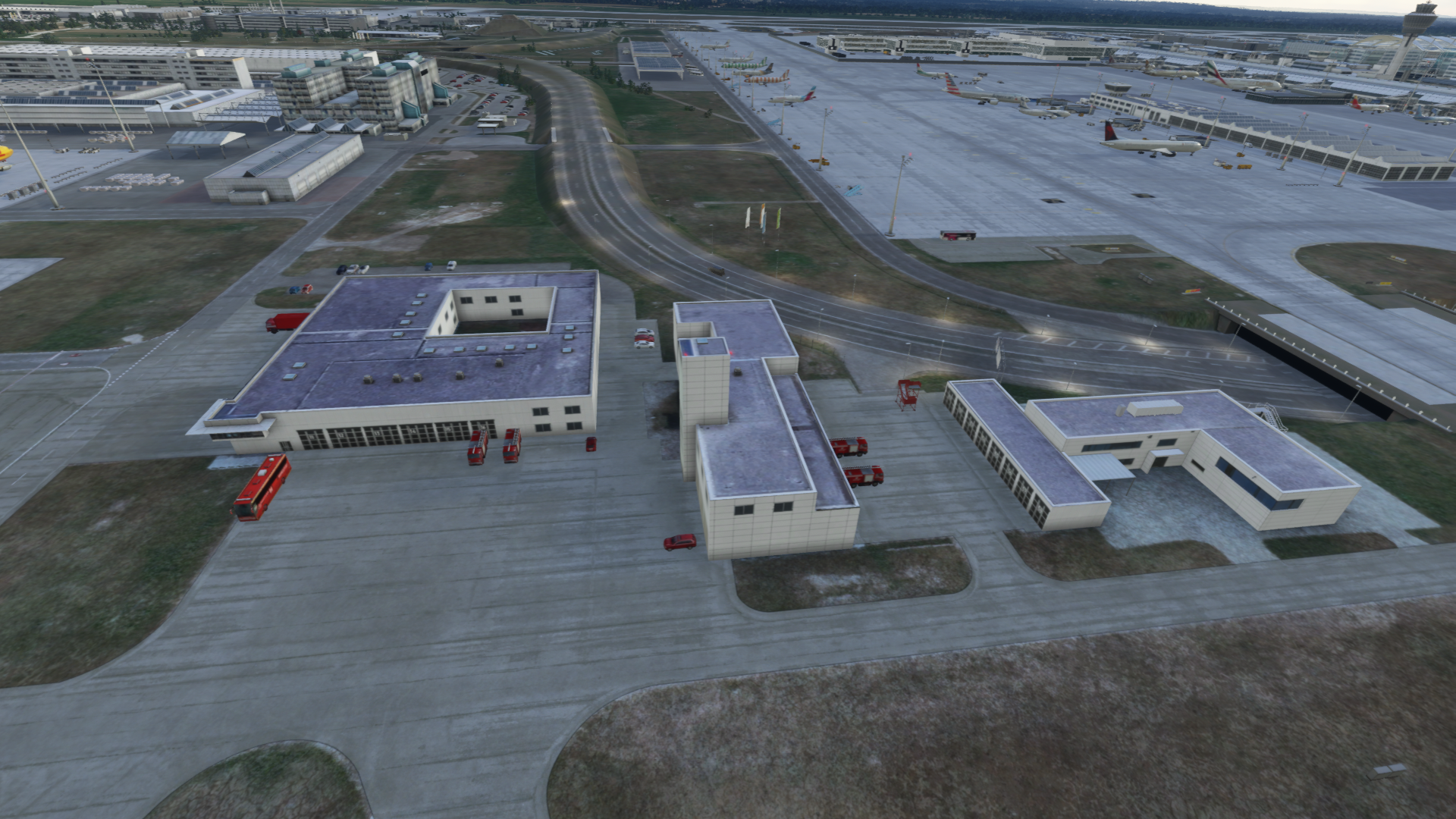
Hangar area:
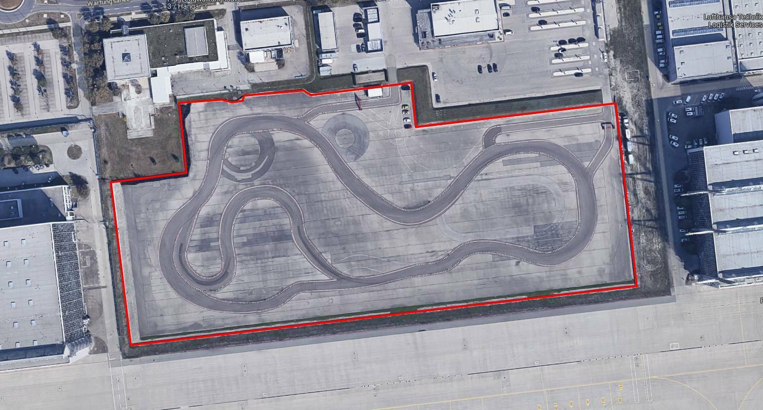
The Audi driving training area is clearly separated from the apron by barriers with AUDI advertising and fences. These are completely missing.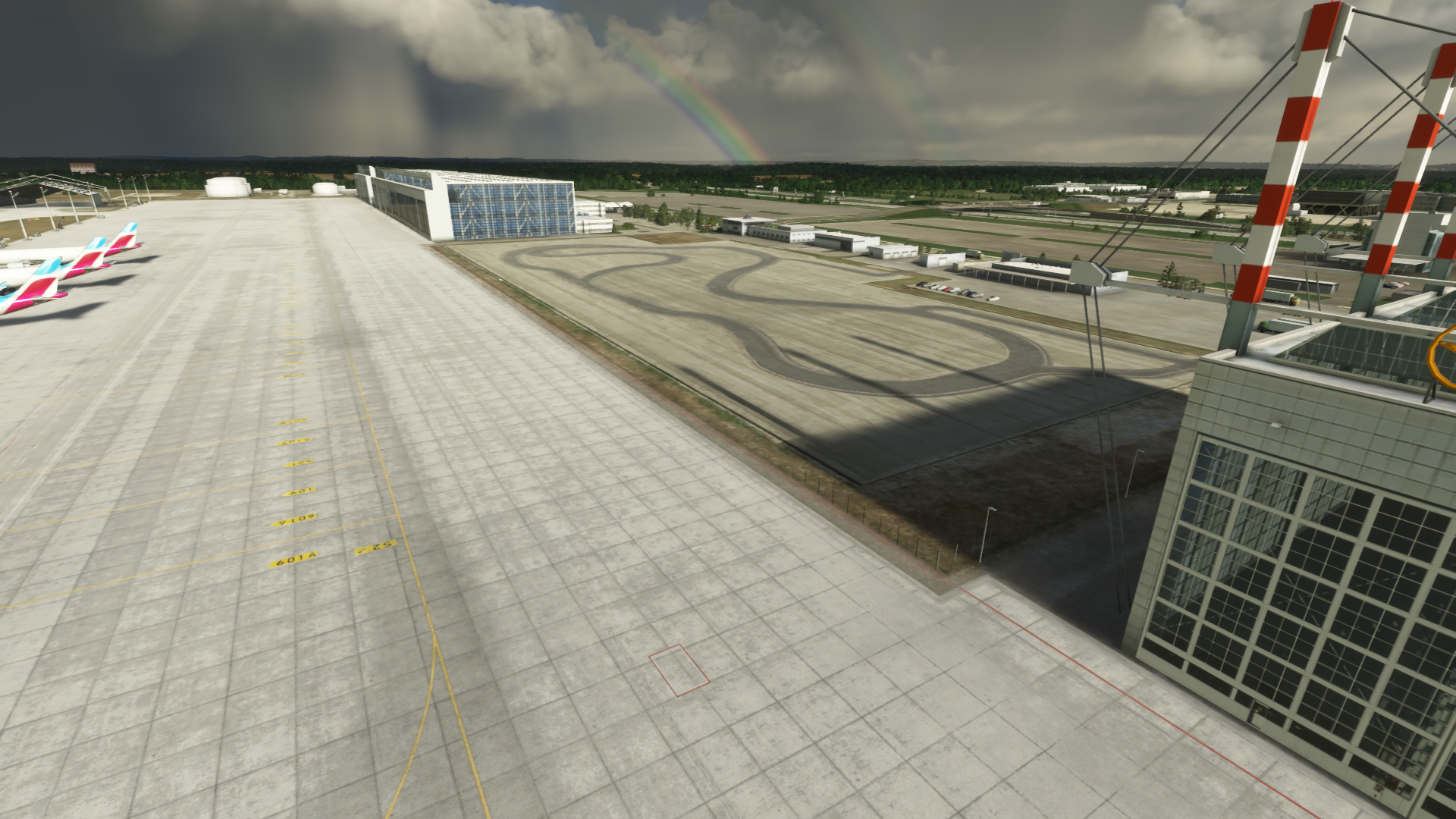
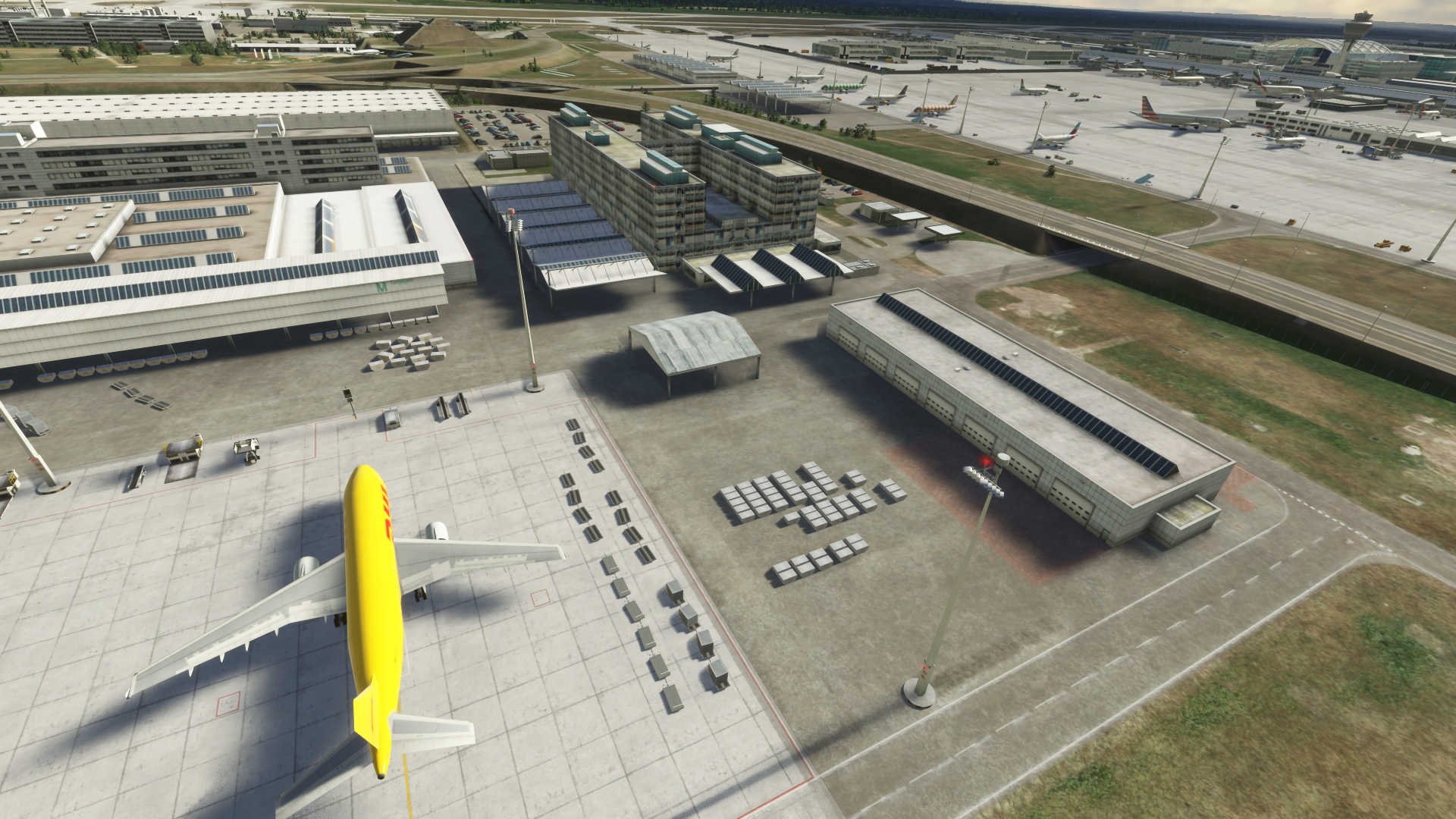
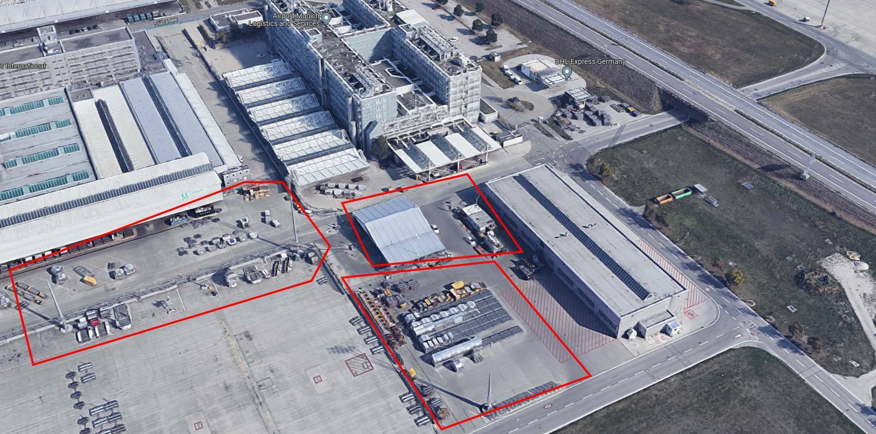
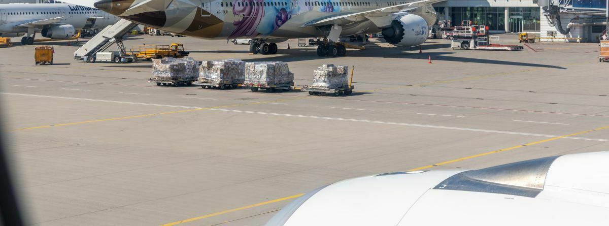
Even though it's nice to have some cargo standing around at the cargo terminal - there could be a lot more, and not so neatly lined up. It looks very sterile.
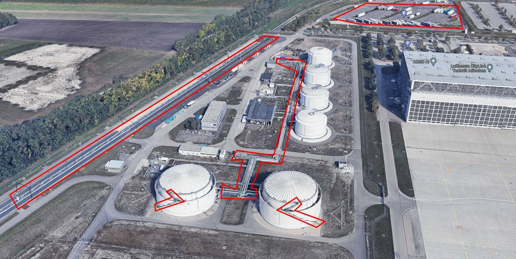
Well, unfortunately there is a lot missing at the fuel depot.
Ladders at the tanks, distribution system, station, overhead lines, in real life there is ALWAYS a tanker train on the tracks, in the background there is a large truck car park... Everything is simply missing here.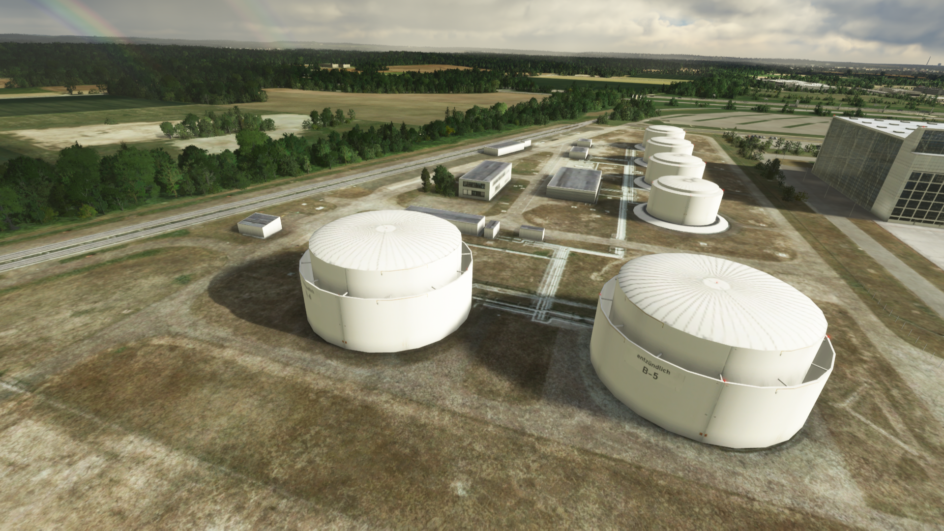
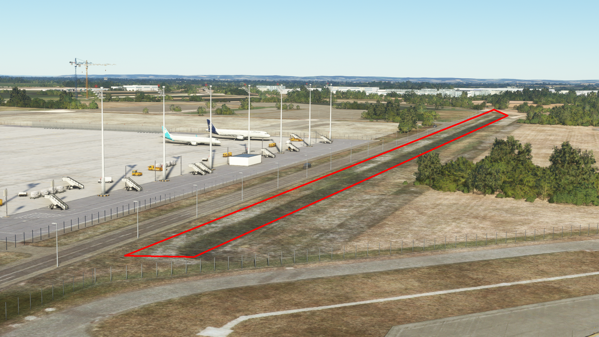
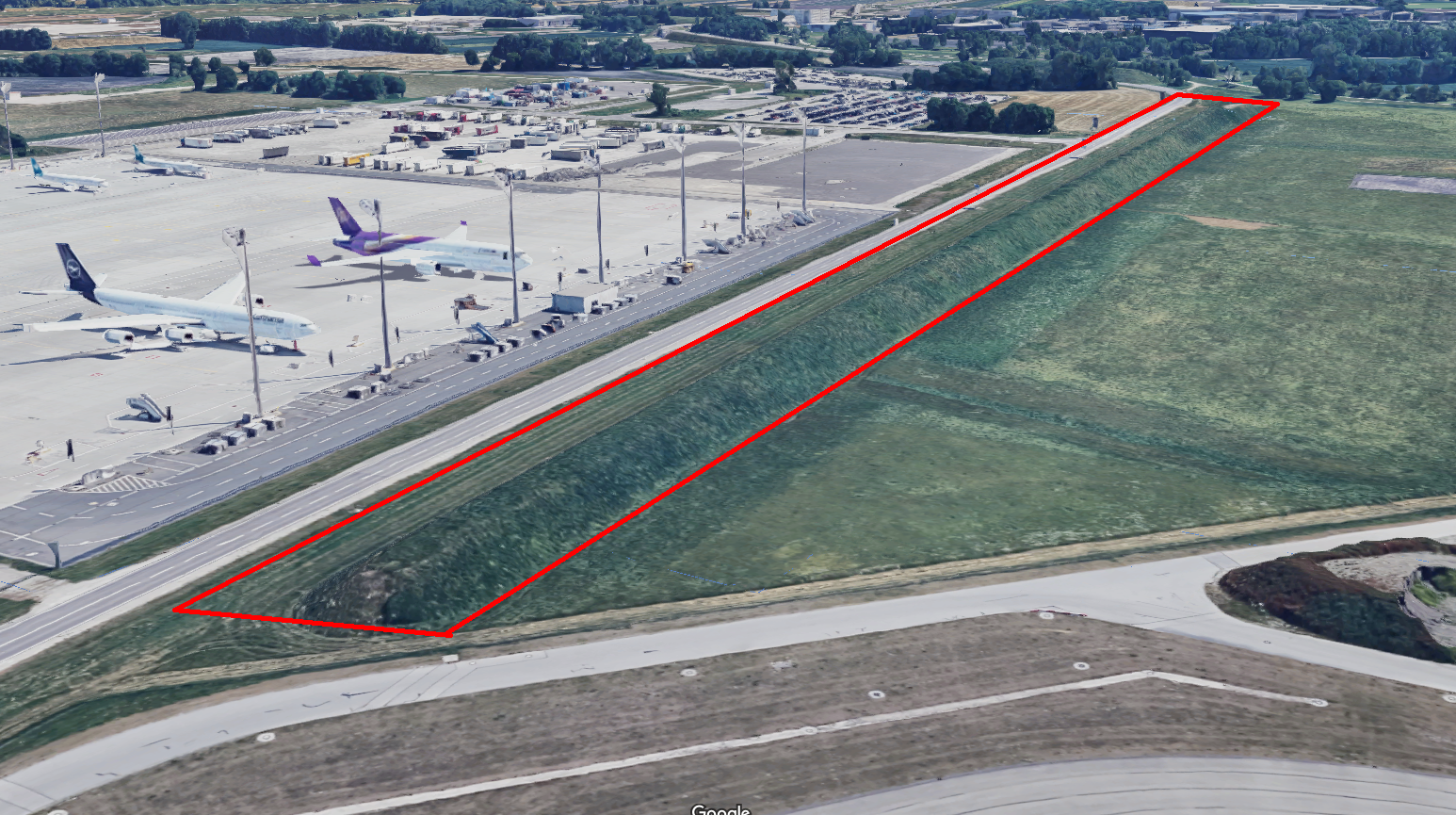
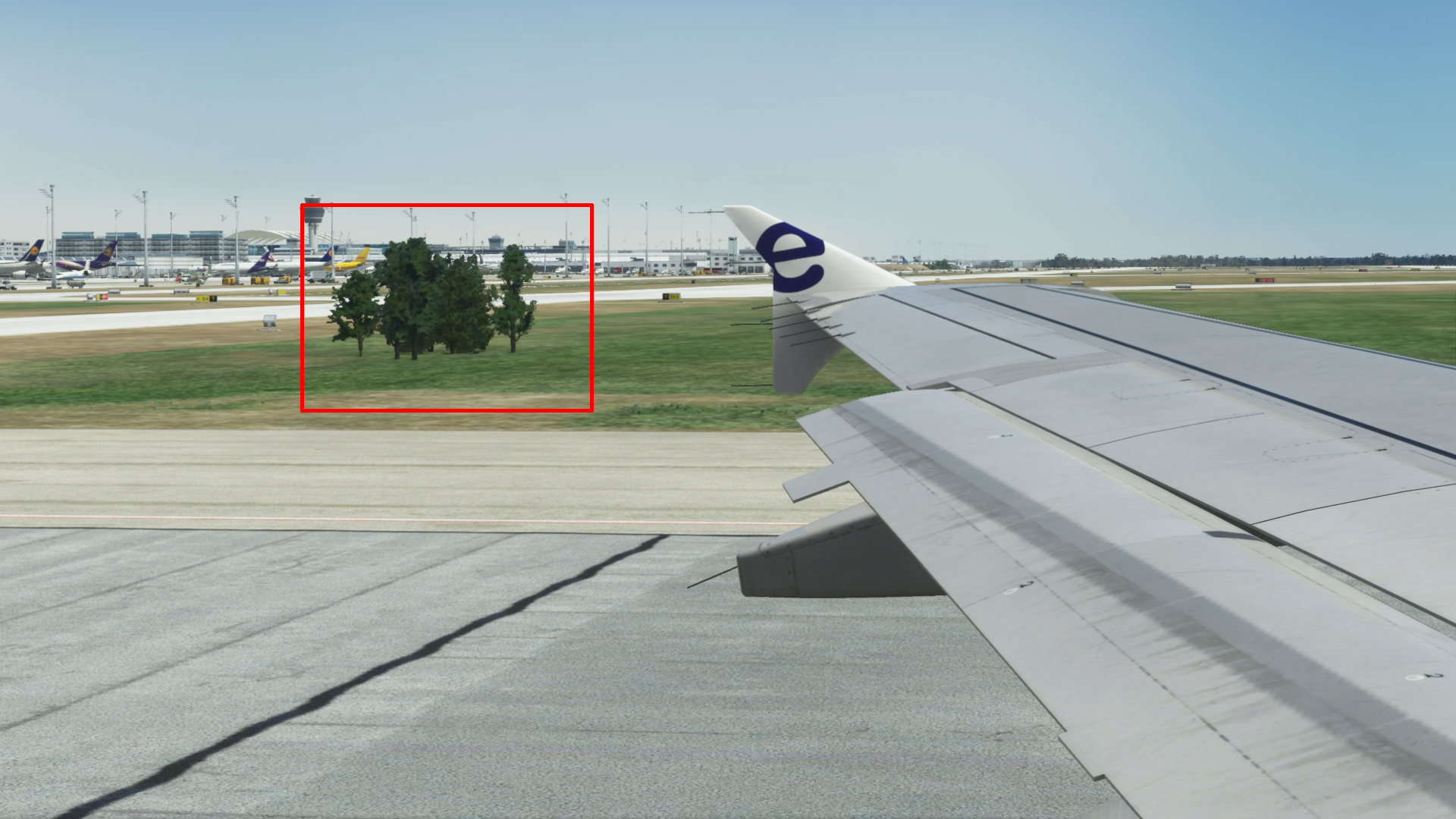
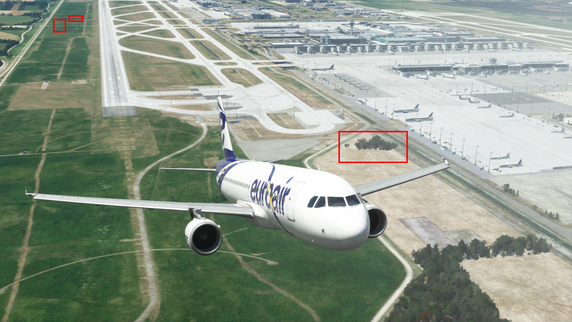
Around both runways you will find trees and large bushes everywhere that don't belong there!
This has become a real no-go.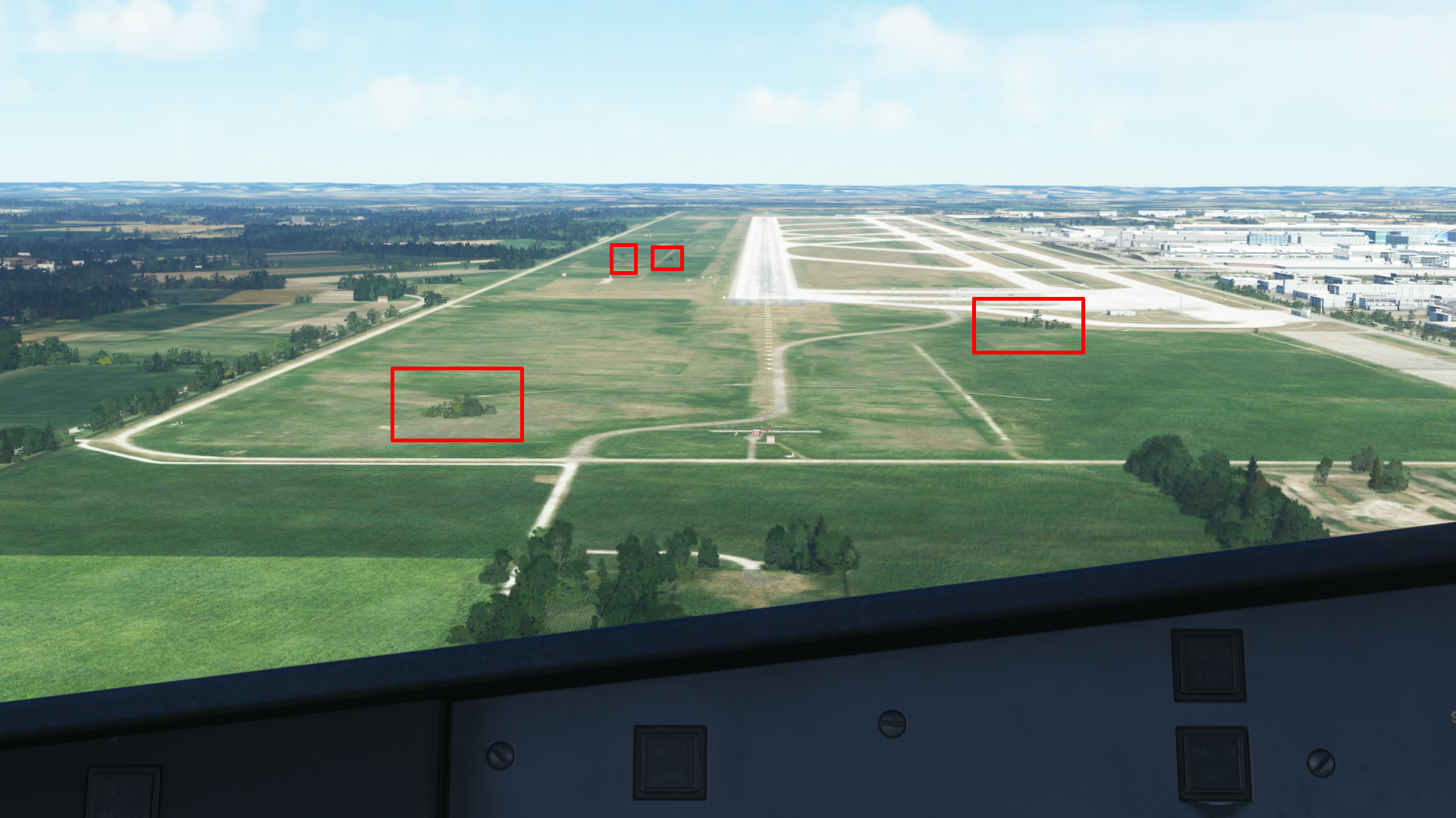
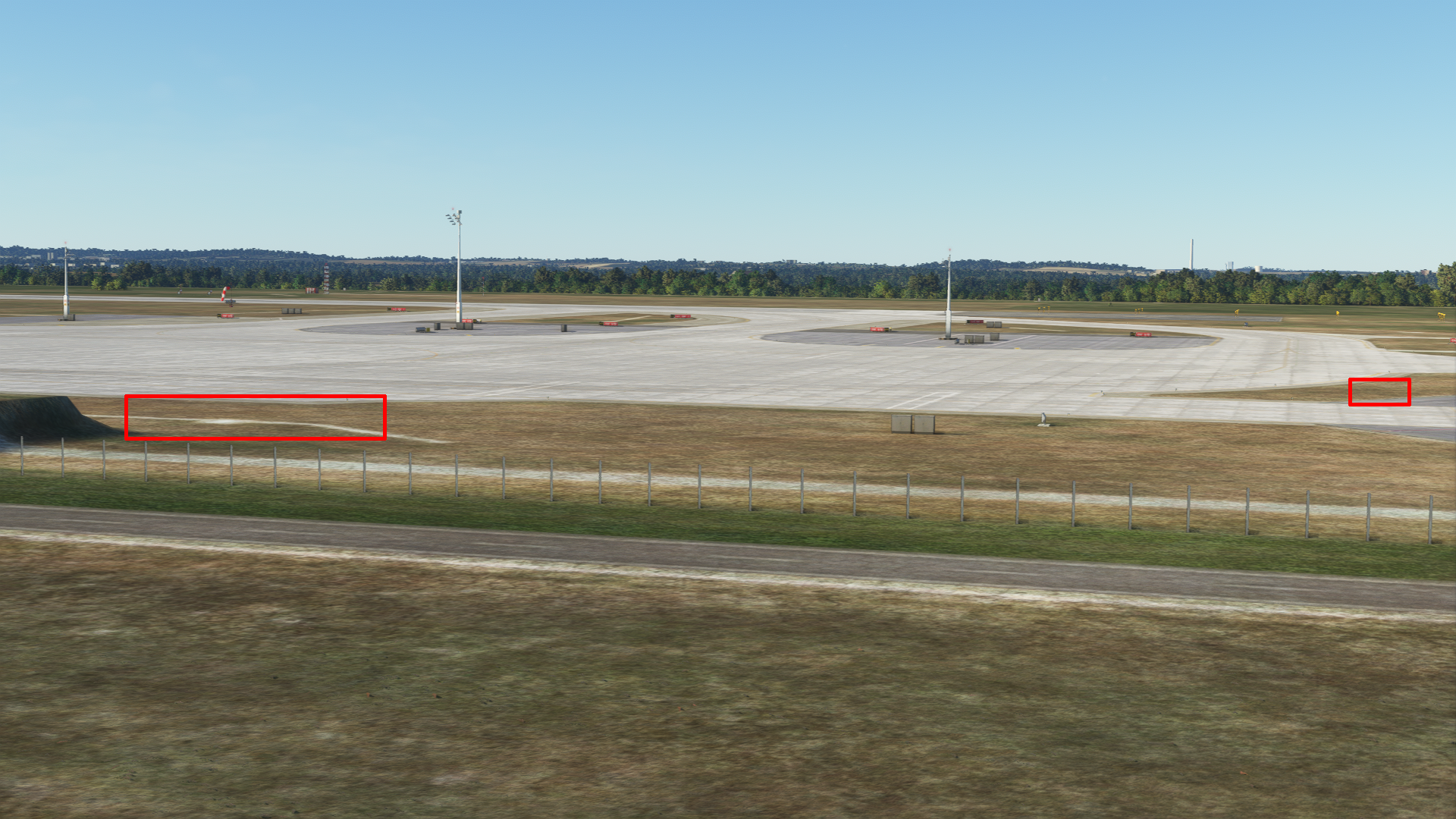
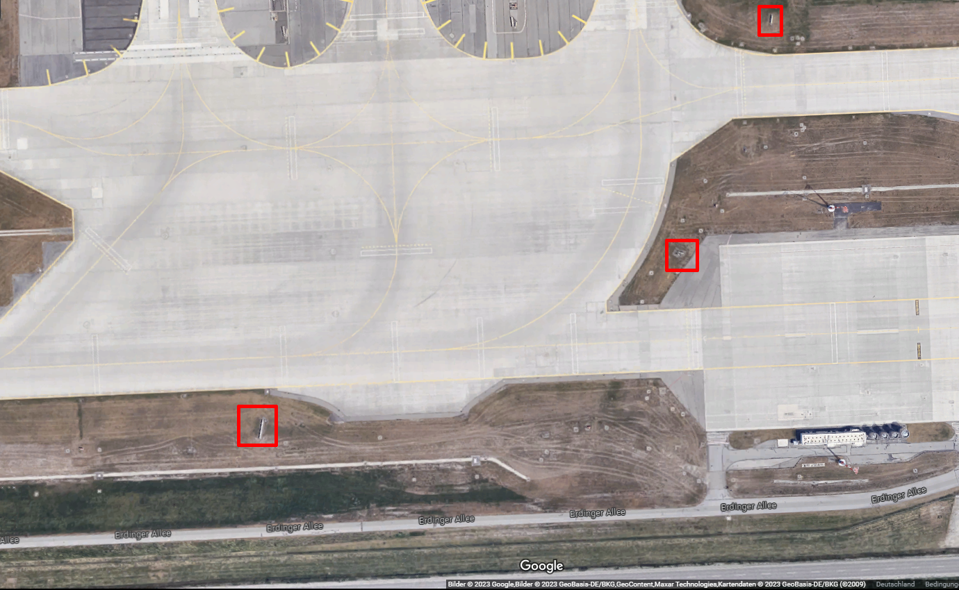
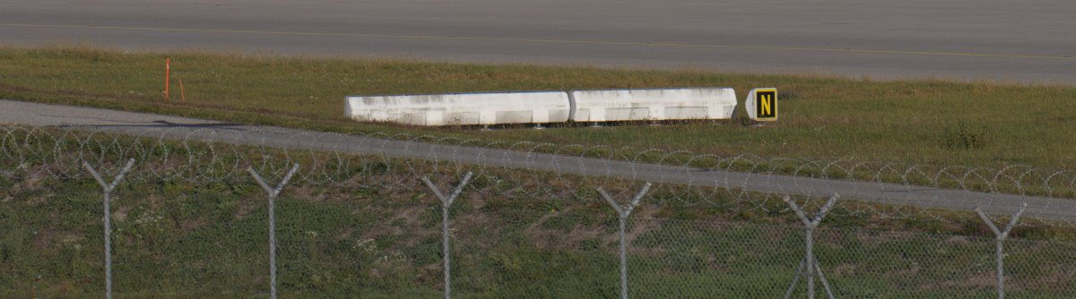
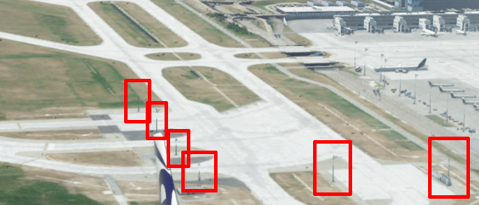
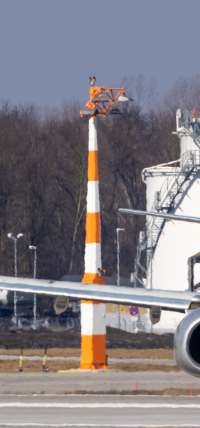
In the last picture you can also see how one measuring station is completely missing!While we're at it: The lamp posts on the Turnpads are orange and white striped!
In general, it would be nice if de-icing vehicles were also parked at the pads in winter!
The topic of taxiways:
The taxiway edge lights only pop up in the dark when rolling onto a taxiway bridge. This should be corrected.In places the taxiways are not displayed correctly:
In general about the runway/taxiway/apron textures:
The textures don't look quite right. Both colour and structure just don't seem right.
Unfortunately, it's just very difficult to describe, it's just the impression when you know the airport and see the scenery in comparison. It just doesn't seem right.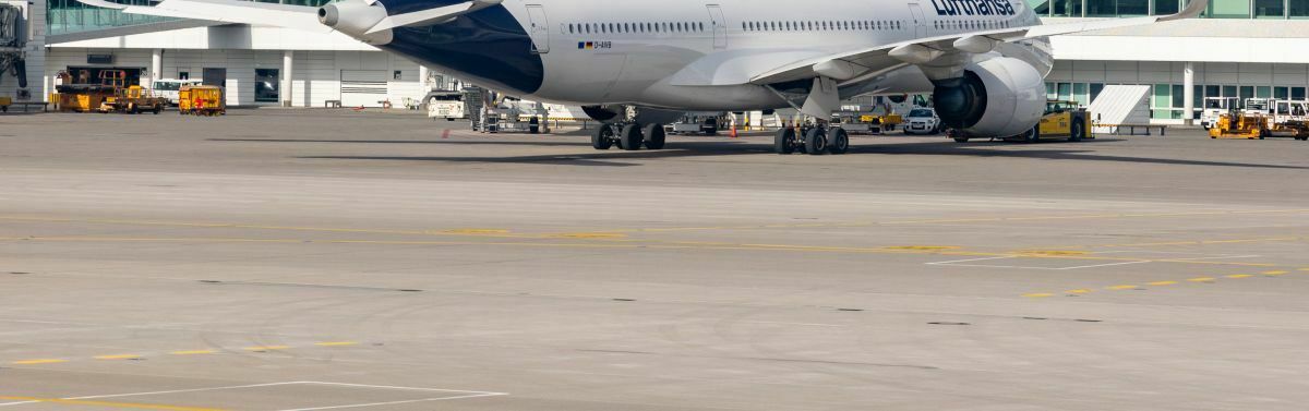
To the grassy areas: The "grass colours" look very, very dry and desaturated. This may be appropriate in September - but most of the year the grass looks completely different.
Either more yellow/brownish in winter, or really rich green in spring/summer. Even if it's not quite easy, would it be possible to implement 2/3 seasons here?
The last item on my list for now: Could the parking codes in AFCAD be adapted? It makes your toenails curl when Emirates, Condor or Air France park at Terminal 2 and Lufthansa planes at Terminal 1.
So much for now - but there may be more to come.
As I said at the beginning - it is not my intention to make the scenery look bad, but to constructively help to make the scenery look better, so that it looks more like MUC, and not like a European airport thrown together.
I know that the scenery is based on MisterX's models for the XPlane, then converted for P3D and now brought into the MSFS, so it is quite limited.
But at the same time it has to be said that for a scenery in this price range (24,95 €) you can expect the best quality in MSFS. Unfortunately, this does not quite fit together yet.
I myself have been a plane spotter at MUC for many years and have many thousands of photos on my PC (well, of the planes of course, but you can also see something of MUC in the background...).
If you need pictures, please contact me! If necessary, I can also go to the airport to take pictures.
I wish you all another beautiful Sunday!
-
1
-
2
-
17
-
vor 10 Stunden schrieb Mathijs Kok:
We have no major plans for functional updates.
That in itself is a great pity and (for me at least) also surprising.
Are there any plans at all for the future of NDP, or will it simply die within the next few years, similar to PFPX?
-
Hello everyone!
First of all, yes, this post may be influenced by the release of Navigraph Charts version 8.
I am just a little surprised that there have been no updates to the NDP charts for a long time.
Yet the NDP charts have a really outstanding unique selling point: the LiDo charts.
I myself don't want to leave LiDo for anything in the world, I simply can't deal with the Jeppesen charts. And I'm sure there are many who see it the same way.
But I also have to say that Navigraph is becoming more and more attractive simply because of the many, many pleasant functions "around it" and also because of the significantly more functions provided by the software.
Now the NDP charts are of course not only interesting for FSX or P3D users, but also for MSFS users.
That's why I'm simply asking the question here: In what form will the software for the NDP charts be further developed, and if not, why not?-
2
-
-
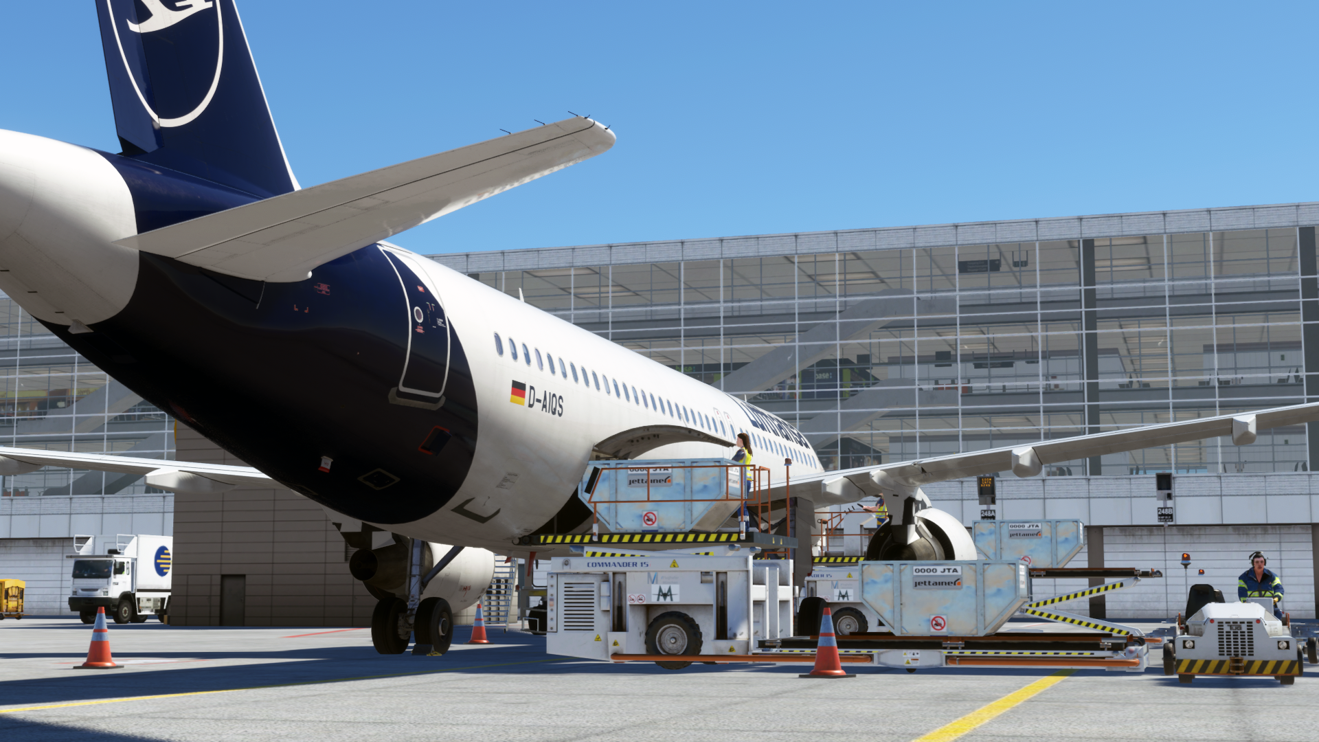
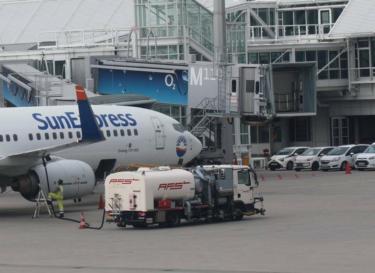
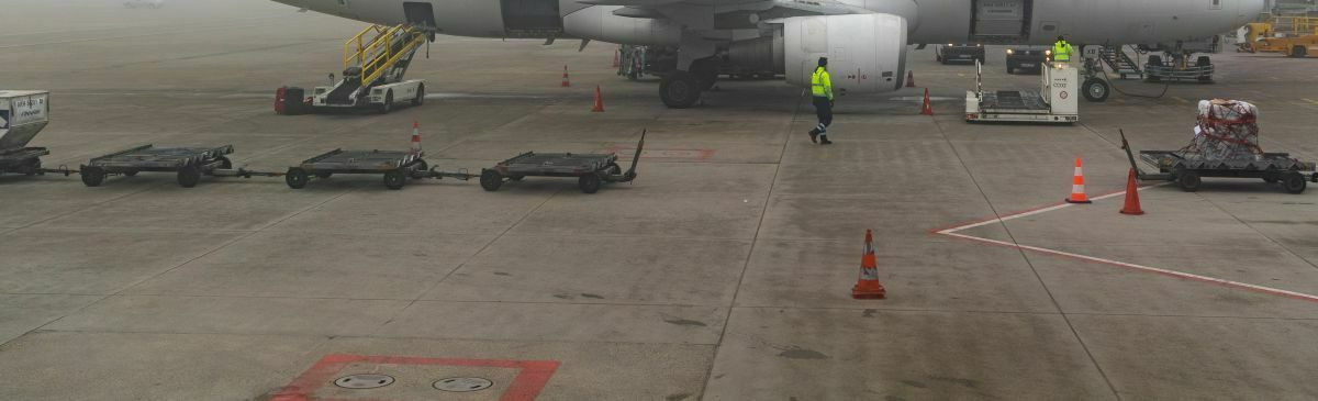
My picture for this month, a new one:
Unloading in Munich:
-
2
-
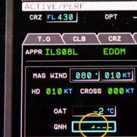
June's ScreenShot Contect:- Attention to Detail!!
in Videos & Screenshots, Screenshot contests
Posted
Hello everyone,
I also had to think for a moment about which of the many details would be photogenic...
In the end, I decided on the cockpit of a Lufthansa A319, here approaching Biarritz.